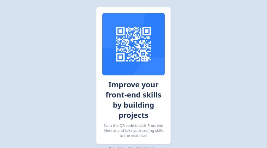
Design comparison
SolutionDesign
Solution retrospective
What are you most proud of, and what would you do differently next time?
That I was able to get through the first challenge. It seems like a lot to take in but just took it step by step.
What challenges did you encounter, and how did you overcome them?Trying to get everything right. I used some tutorials along the way to help me out. I have taken some basic classes but wanted to jump in and try it out.
What specific areas of your project would you like help with?Trying to get the sizing correct and make sure everything is line up properly. I have just started to learn bootstrap, so hopefully it will help me line things up properly.
Community feedback
Please log in to post a comment
Log in with GitHubJoin our Discord community
Join thousands of Frontend Mentor community members taking the challenges, sharing resources, helping each other, and chatting about all things front-end!
Join our Discord
