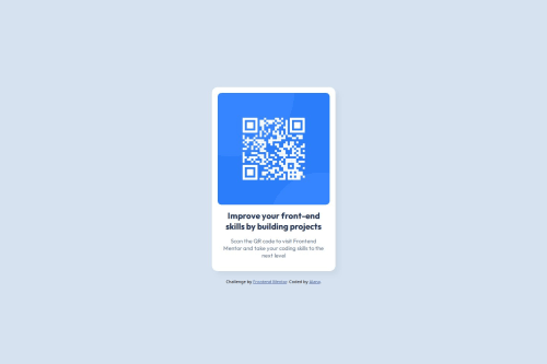
Basic landing page using flexbox

Solution retrospective
I'm most proud of being able to build this from scratch without external libraries or looking at other projects I already made. I figured out how to use flexbox here (with the help of a cheat sheet).
Next time I would place a little more focus on making this a responsive page, as well as committing to using flexbox from the beginning.
What challenges did you encounter, and how did you overcome them?I'm still struggling to understand overflow in the context of margins and padding. It took me a lot of trial and error in the development tools to see which object in the body was the culprit for the warning message.
What specific areas of your project would you like help with?I was quite unsure about how to achieve the right font sizing, I ended up using rems for the headline.
Please log in to post a comment
Log in with GitHubCommunity feedback
No feedback yet. Be the first to give feedback on AmateurShark's solution.
Join our Discord community
Join thousands of Frontend Mentor community members taking the challenges, sharing resources, helping each other, and chatting about all things front-end!
Join our Discord