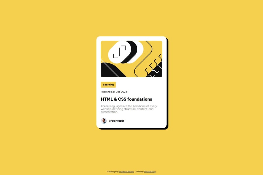
Design comparison
Solution retrospective
I'm proud of the fact that its finally starting to click. I'm also proud of the fact that I was able to use the feedback I got from my last project ( improving centering items with grid) right away. It took me a few times to get to this point but unless I did something wrong that I'm not aware of I wouldn't change it.
What challenges did you encounter, and how did you overcome them?I'm still a little confused on when to push things to git hub and what I should put for my commit messages. I usually do the initial commit and then not push again until I'm done with the project.
What specific areas of your project would you like help with?If possible some tips on git and git message like when to push updates and I think I'm still not centering my cards vertically correctly.
Community feedback
- @M-AminAlizadehPosted 8 months ago
Hey @mking0823
I hope you are well
About learning Git I suggest you to watch this video -- it's old but gold for beginners
The core commands are:
git clonegit statusgit addgit commitgit push
I suggest you don't overcomplicate it to yourself
Marked as helpful0 - P@dedo-devPosted 8 months ago
Hey there @mking0823,
About Git, before starting the learning path I had never used it, I used GitHub Desktop, but to push the updates I had to go into the application. So every time I created the repository and then I forgot to push the progress into the repository which I promptly did when I closed VS Code or even when I reopened GitHub.
I also brought this flaw into the first two challenges of the learning path, obviously, this thing takes away all the work utilities of Git or GitHub itself, but this is to tell you that you are not alone.
Now the advice:
- If you haven't done so, install git on VS Code, it's really useful and I honestly find it more intuitive than the console;
- Push to the repository whenever you make progress, for example, do you create a CSS reset file? Push it to the repository with a message like
reset initialized. Do you write the first element of HTML? Push it. Examplecard structure made
So summarize what you did and push every time to your repo so you're enable to scroll through the history and if you need you know the meaning of every step.
About centering the card vertically I think you need to change this code
grid-template-rows: 94% 1fr;with thisgrid-template-rows: 1fr;or thisgrid-template-rows: 1fr auto;I will suggest also using Relative Units as
rem&eminstead ofpx, Logical property aspadding-inline-startinstead ofpadding-left, wrapping all the card elements in anarticletag and last but not least think Mobile-first when you start the next challenge, because the card isn't responsive on a mobile device.Hoping you find this helpful ✌️
Keep learning 📖 Keep coding💻Marked as helpful0
Please log in to post a comment
Log in with GitHubJoin our Discord community
Join thousands of Frontend Mentor community members taking the challenges, sharing resources, helping each other, and chatting about all things front-end!
Join our Discord
