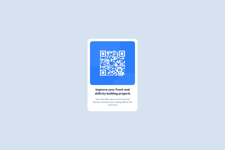
Design comparison
SolutionDesign
Solution retrospective
What are you most proud of, and what would you do differently next time?
I'd probably use different semantic element for text, specifically first "heading" element.
What challenges did you encounter, and how did you overcome them?Most difficult part were git and github because I have scarcely any experience with either.
What specific areas of your project would you like help with?I think I did well enough although all suggestions are welcome.
Community feedback
- @VADER900000Posted 4 months ago
id make it a bit bigger
0@stezorPosted 4 months ago@VADER900000 Hi. Font size and picture? You are right, that would make it closer solution to the original design. Thanks!
0
Please log in to post a comment
Log in with GitHubJoin our Discord community
Join thousands of Frontend Mentor community members taking the challenges, sharing resources, helping each other, and chatting about all things front-end!
Join our Discord
