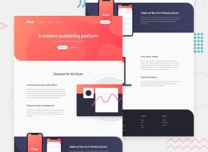
Design comparison
Solution retrospective
CSS is very clumsy.Any suggestions appreciated.Thanks.
Community feedback
- @Blazing-MikePosted over 3 years ago
Beautiful UI 😍.... I love the way you took things to details and it works fine... I checked through your CSS code and I noticed a few things.
Naming: Give your element descriptive and understandable class names... then use those class to style... Using classes for style will make it easier to use it for a similar component. Read more Block element methodology or object oriented CSS they're methods that can improve how you write CSS
Reusability: Create reusable components with classes... For instance you have on your page buttons with the same width and height but different color ( same structure different skin) you can reuse components... I also notice the footer list use classes to style them instead of the footer > ul> li ,browser reads CSS from left to right so it makes thing slower and it's not a best practice.
Naming: also part of BEM methodology
Those I things I noticed... You did a great job
Marked as helpful0@AthreyaG4Posted over 3 years ago@Blazing-Mike thank you for your comment. I will try to improve on those points. Have a good day.
0
Please log in to post a comment
Log in with GitHubJoin our Discord community
Join thousands of Frontend Mentor community members taking the challenges, sharing resources, helping each other, and chatting about all things front-end!
Join our Discord
