

Design comparison

Community feedback
- @mikej321Posted over 1 year ago
Hello there and excellent work on your project!
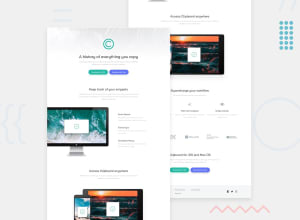
A quick tip I could give you for the future is to constrain your site to a smaller size, so that the user doesn't need to view the site from left to right. I learned from reading a book about UI that it's better to constrain the site's size to where the user only has to look forward and slightly left or right. It will also solve the problem of your site's pictures appearing like they are cut off in the comparison pane above, although the pictures look perfectly fine when you visit the site. I would suggest maybe 1600px as a max, but tinker around with it and find a size that fits you. Other than the size of it, it looks brilliant! I hope this helps and good luck on your journey!
Michael
Marked as helpful0@mikej321Posted over 1 year ago@Ace-droid no biggie, let me know if you need any help in the future. I wish you luck on your journey!
Michael
0

Please log in to post a comment
Log in with GitHubJoin our Discord community
Join thousands of Frontend Mentor community members taking the challenges, sharing resources, helping each other, and chatting about all things front-end!
Join our Discord