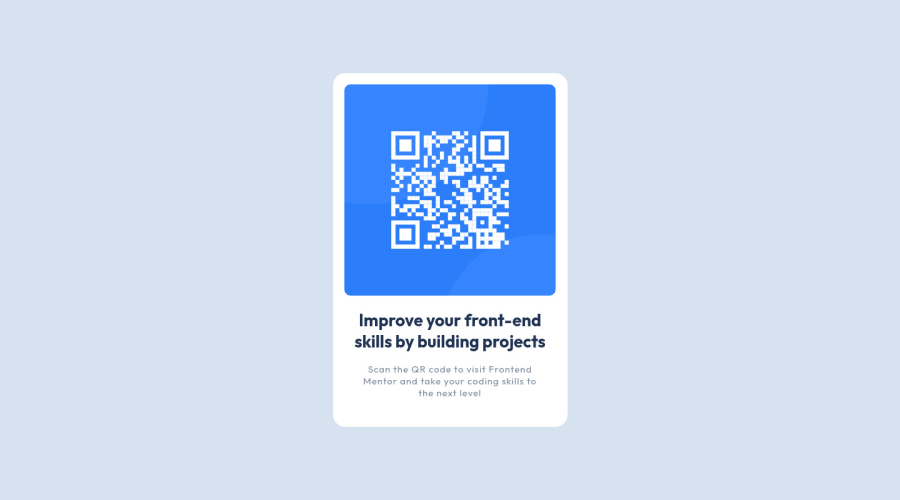
Design comparison
Solution retrospective
This is my first project after following some online resources so there's likely quite a few areas for improvement. Happy to recieve feedback on areas for improvement.
Community feedback
- @Bayoumi-devPosted over 2 years ago
Hey John, Great work! you just need to put the component in
<main>...</main>
tageMarked as helpful1@JohnPORPosted over 2 years ago@Bayoumi-dev Hello
Thanks for your feedback. I can't believe I forgot the main tags. I'm definitley going to kick myself over that one.
0 - @RJC26Posted over 2 years ago
Hey man, looks great! I noticed you put
margin: 0;
padding:0;
in body andbox-sizing: border-box;
in html, you could always use:*{ box-sizing: border-box; margin: 0; padding: 0; }
This does the same thing just a bit of tidying! Looks awesome!
Marked as helpful0@JohnPORPosted over 2 years ago@RJC26 Hello
Thanks for the feedback.
I've been watching loads of Brad Traversy's video and the does the same. Silly of me to miss considering how often I've seen it.
0
Please log in to post a comment
Log in with GitHubJoin our Discord community
Join thousands of Frontend Mentor community members taking the challenges, sharing resources, helping each other, and chatting about all things front-end!
Join our Discord