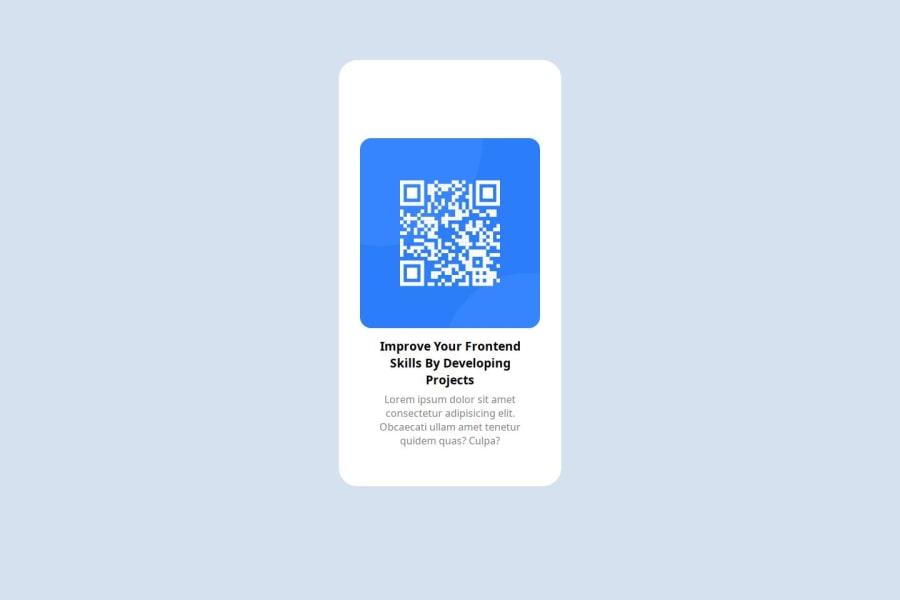
Design comparison
Solution retrospective
It was pretty easy to build. Suggestions are welcomed!
What challenges did you encounter, and how did you overcome them?Setting the width and height of element as close as possible to the original image was quite difficult.
What specific areas of your project would you like help with?.
Community feedback
- @Aalphakeem-AdroitPosted 3 months ago
Congratulations on the completion of this challenge 🎊
Try removing
height: 71vh;from your .main as it's unnecessary if you want your project to be accurate.Give your .main some padding maybe 10 or 15px and lets see.
If your columns are looking clumsy after this change, try making your image and a div carrying your two paragraphs the child of your .main. With this, you can give your img a
border-bottom: 20px;.0
Please log in to post a comment
Log in with GitHubJoin our Discord community
Join thousands of Frontend Mentor community members taking the challenges, sharing resources, helping each other, and chatting about all things front-end!
Join our Discord
