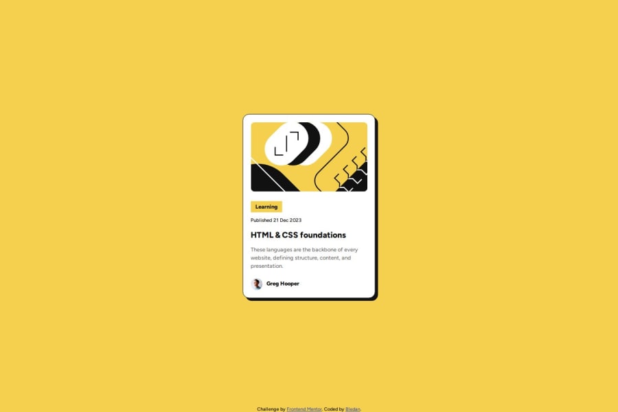
Design comparison
Solution retrospective
I'm proud of the short time I've needed to complete the challenge, even though it is entry-level difficulty.
What challenges did you encounter, and how did you overcome them?Fine layout measuring difficulties, which allowed me anyway to improve my understanding of measurement units and when one should be used instead of another.
What specific areas of your project would you like help with?Fine layout measurements, I think it's still a bit imprecise...
Community feedback
- @BeeAlmightyPosted 4 months ago
I love how you didn't do the obvious with CSS Flexbox or Grid but i still think it would have been much more easier to handle especially when bigger projects come along but all together, Great work! Now answering the preset questions:
- Yes, i think your HTML is quite semantic.
- I think you used a mobile-first workflow as well.
- Your solution was slightly smaller than the design given but all together, Great work!
Marked as helpful0 - P@taru2512Posted 4 months ago
well coded, though solution is same but seems there is some variation in pixels from the original design though its difficult to get that accuracy
0
Please log in to post a comment
Log in with GitHubJoin our Discord community
Join thousands of Frontend Mentor community members taking the challenges, sharing resources, helping each other, and chatting about all things front-end!
Join our Discord
