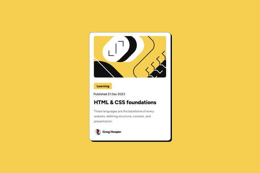
Design comparison
Community feedback
- @TedJenklerPosted 7 months ago
Hi @Davidty143,
Nice project! Here are a few suggestions:
I noticed that there are too many containers (i.e., <div> elements). To simplify your layout, you can make the <body> a flex container with align-items: center and justify-content: center. Use one main card with flex-direction: column to stack all content without unnecessary nesting. This approach will greatly improve your SEO and accessibility, and also make your code more readable and maintainable, especially for larger projects. Additionally, you can use the <footer> element for the Frontend Mentor footer.
I would also suggest using more HTML elements for the structure. For example, using <h2> for headings and <time> for dates would improve the HTML quality and accessibility.
Keep up the great work!
Best, Teodor
Marked as helpful0@Davidty143Posted 7 months ago@TedJenkler thanks for your feedback!, I will definitely apply your suggestions to improve my skills.
1@Davidty143Posted 7 months ago@TedJenkler thanks for your feedback!, I will definitely apply your suggestions to improve my skills.
0 - P@StroudyPosted 7 months ago
Hey, Great solution, Some feedback,
- Setting a height and width attribute to your
<img>will increase performance to reduce layout shifts and improve CLS, It reserves the space on the page for the image, - You should apply a full modern reset to make things easier as you build, check out this site for a Full modern reset
- Using a naming convention like BEM, Using proper naming will prepare you for the changes in design of the website.
- Using
max-width: 100%ormin-width: 100%is way more responsive then justwidth:100%, check out this article also from the same Frontend mentor dev responsive-meaning, she goes into more detail. - You should avoid using
pxas it is an absolute unit and not a responsive unit likeremorem, You should look at this article from a Frontend mentor dev, Why font-size must NEVER be in pixels. - Another great resource for px to rem converter.
- Line height is usually unitless instead of
line-height: 150%;should useline-height: 1.5;this means it is 1.5 x the font-size, unitless value ensures that the line height will scale proportionately. - Missing a
<meta>description tag for SEO purposes,
I hope you found some of this information helpful, You should give the articles a good read and I look forward to seeing some more from you, Happy coding! 💻
Marked as helpful0@Davidty143Posted 7 months ago@Stroudy thank you for your feedback, I'll try to study and research more on these, your suggestions are much appreciated.
0 - Setting a height and width attribute to your
Please log in to post a comment
Log in with GitHubJoin our Discord community
Join thousands of Frontend Mentor community members taking the challenges, sharing resources, helping each other, and chatting about all things front-end!
Join our Discord
