

Design comparison
SolutionDesign

Solution retrospective
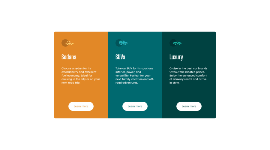
Hello! The desktop version looks amazing. I dare to say it looks exactly the same as the preview, but I can not say the same with the mobile version... Can someone help me to make this responsive and looking good on mobile version? I know about the mediaqueries and all that, but for some reason I can not make it work. I would appreciate some guiding here, thanks!
*Things needed on mobile version: Change the border-radius and the width of the boxes.
Community feedback
Please log in to post a comment
Log in with GitHub
Join our Discord community
Join thousands of Frontend Mentor community members taking the challenges, sharing resources, helping each other, and chatting about all things front-end!
Join our Discord