Design comparison
SolutionDesign
Please log in to post a comment
Log in with GitHubCommunity feedback
- @alvarozama
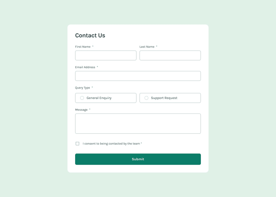
Your page looks pretty good overall. However, here's a few things I noted could use some correction:
- Your email error message is always the same, regardless of whether the error stems from there being no input at all or from the input being invalid. According to the HTML file, if the email address is invalid, a different error message should appear.
- Just as above, you're not using the correct error messages for the radio buttons and for the checkbox input.
- I wanted to take a look at your code to verify if all the ARIA labeling and other accessibility elements are present, but couldn't find them. It would be good for us peers if you decluttered your repository a bit.
Other thant that, the page looks pretty good and I loved the animation on the success message. Keep it up!
Join our Discord community
Join thousands of Frontend Mentor community members taking the challenges, sharing resources, helping each other, and chatting about all things front-end!
Join our Discord
