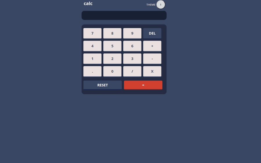
Design comparison
Solution retrospective
It takes more time than I guessed. However, it´s ready!
Let me know if you have any advise.
¡Saludos!
Community feedback
- @0xabdulkhaliqPosted 8 months ago
Hello there 👋. Congratulations on successfully completing the challenge! 🎉
- I have a suggestion regarding your code that I believe will be of great interest to you.
CSS 🎨:
- Let me explain, How you can easily center the component for better layout without usage of
absolutepositioning.
- We don't need to use
absoluteto center the component both horizontally & vertically. Because usingabsolutewill not dynamical centers our component at all states
- To properly center the component in the page, you should use
FlexboxorGridlayout. You can read more about centering in CSS here 📚.
- For this demonstration we use css
Gridto center the component
body { min-height: 100vh; display: grid; place-items: center; }- Now remove these styles, after removing you can able to see the changes
body {
  position: absolute;
  left: 450px;
}
- Now your component has been properly centered.
.
I hope you find this helpful 😄 Above all, the solution you submitted is great !
Happy coding!
Marked as helpful0@Eddieramirez29Posted 8 months ago@0xabdulkhalid Hello!
I just added: min-height: 100vh; display: grid; place-items: center;
these lines into my code. However, it did not center my components. The calculator is now on the left side.
I think there´s something on my code that it does not allow to center the components. I spent some time looking for it, but I found nothing.
I will try to improve my code and upload it
Thanks for your help. :)
0@Eddieramirez29Posted 8 months ago@0xabdulkhalid I made some changes and it works better.
See!
body { position: absolute; top: 50%; left: 50%; transform: translate(-50%, -50%); background-color: hsl(222, 26%, 31%);
}
When I open the link with my smart phone it appears almost in the center and you do not need to look for it in the page as before.
0@0xabdulkhaliqPosted 8 months ago@Eddieramirez29, Actually the real reason behind this bug is due to poor markup structure.
If you need to center the component then the
body(parent, wheregridorflexapplied ) needs to have only one child so that other elements will not interfere the layout.But for your case, you have added two childs for
body<body> <main class="framework"> ..... </main> <footer id="keyboard"> ..... </footer> </body>
- An important to state here is that the current markup structure definitely needs to be refactored otherwise it would cause accessibility issues in real world scenarios.
- For example, nesting
buttonelements insidefooteris not a good practice. Footer is there for providing details about copyright and authorship information not for addingbuttonelements.
- And using
headerinsidemainelement for Calculator display and Theme toggle is also not appreciated. The markup i prefer would be like this,
<body>
    <main class="framework">
        <div class="container">
			<div class="row">
				<div class="col-6 title1">
				calc
				</div>
				<div class="col-6 title2">
					THEME
					<button id="toggleButton" class="toggle-button state-1" onclick="toggleState()">1</button>
				</div>
			</div>
		</div>

        <input id="screen" type="text">

        <div class="button-grid">
            <button class="button button-7">7</button>
            <button class="button button-8">8</button>
            <button class="button button-9">9</button>
            <button class="button button-del">DEL</button>
            <button class="button button-4">4</button>
            <button class="button button-5">5</button>
            <button class="button button-6">6</button>
            <button class="button button-mas">+</button>
            <button class="button button-1">1</button>
            <button class="button button-2">2</button>
            <button class="button button-3">3</button>
            <button class="button button-menos">-</button>
            <button class="button button-punto">.</button>
            <button class="button button-cero">0</button>
            <button class="button button-division">/</button>
            <button class="button button-multiplicacion">X</button>
          </div>
          <div>
            <button class="button button-reset" id="reset">RESET</button>
            <button class="button button-igual" id="igual">=</button>
          </div>
    </main>
</body>
You can try to center after updating the markup like this, don't forget to notify me if it works!
Hope am helpful !
0
Please log in to post a comment
Log in with GitHubJoin our Discord community
Join thousands of Frontend Mentor community members taking the challenges, sharing resources, helping each other, and chatting about all things front-end!
Join our Discord
