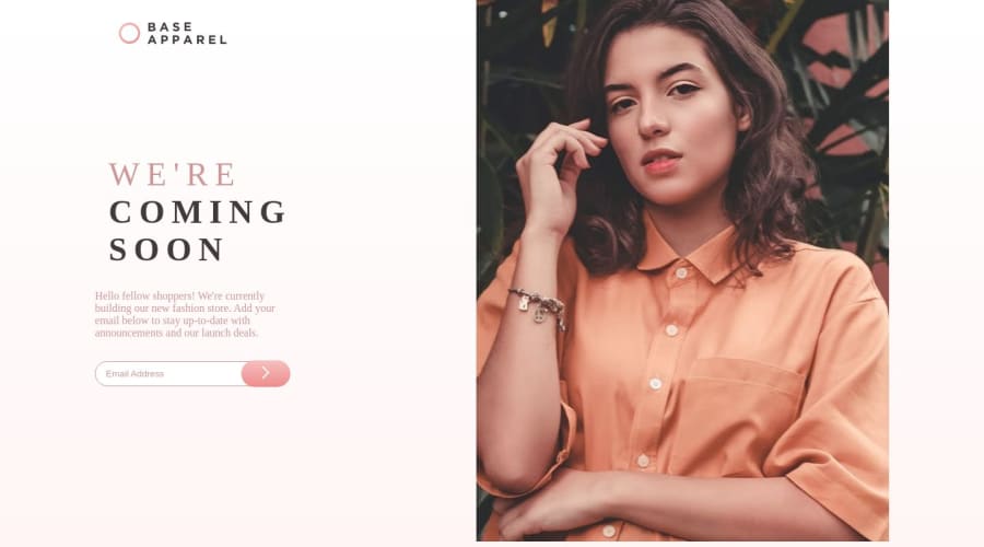
Design comparison
SolutionDesign
Solution retrospective
Any feedback would be great.
Community feedback
- @JetyunPosted about 1 year ago
If You can:
- 100% the height on the profile picture when it is in desktop mode
- maybe start the desktop view around 1016px width? because when I adjusted the screen width until 769px the web design for desktop view is a bit distorted.
- insert max-width for your main-content class so that it is adjustable based on the screen width, and you can match the desktop design better for a bigger width for the text
- you could put a logo for mobile view and another logo for desktop view which you can include in the main-content class so that you don't have to put absolute position for the logo in desktop view and the position for the logo will be consistent when you adjusted the screen width
0
Please log in to post a comment
Log in with GitHubJoin our Discord community
Join thousands of Frontend Mentor community members taking the challenges, sharing resources, helping each other, and chatting about all things front-end!
Join our Discord
