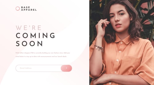
Not Found
Not Found
Not Found
Not Found
Not Found
Not Found
Not Found
Not Found
Not Found
Not Found
Not Found
Not Found
Not Found
Not Found
Not Found
Not Found
Not Found
Not Found
Not Found
Not Found

Submitted

base-appareal

Denis 1,060

@Mod8124

Desktop design screenshot for the Base Apparel coming soon page coding challenge

This is a solution for...

  • HTML
  • CSS
  • JS
1newbie
View challenge

Design comparison


SolutionDesign

Solution retrospective


:0

Community feedback

@anh-vumartell

Posted

At first look, I think 🤔 your problem lies at how you write css selectors when you’re trying to change border color of input field. Your code: #cta form input input:focus { border: 1px solid #f96262; } #cta form input input:active { border: 1px solid #f96262; }

It should be:

#cta form input:focus { border: 1px solid #f96262; } #cta form input:active { border: 1px solid #f96262; }

Marked as helpful

0

Denis 1,060

@Mod8124

Posted

@anh-vumartell thank you ❤️

0

@pikapikamart

Posted

Hey, awesome work on this one. Desktop layout looks great, it is responsive and the mobile state looks great as well.

Ngoc Anh Vu-Martell already gave feedback on this one, just going to add some as well:

  • Always have a main element to wrap the main content of your page. On this one, after the #app selector you could create a main to nest the main content of the page so that it will be inside a landmark.
  • Avoid using id attribute as a selector in css because it is a bad practice due to css specificity. Use class to target elements.
  • Website-logo img should be using the website's name as the alt like alt="base apparel". Remember that a website's logo is meaningful so always make sure it uses the proper alt value.
  • For the hero-image, you could have use a more descriptive alt like alt="a woman wearing base apparel clothings.
  • Your input tag lacks an associated label tag on it. Since there are visible-label, the label would be a screen-reader only label, meaning it would make user of like sr-only class. The text-content should describe what the input needs like the value on the placeholder.
  • Also, the error-image is only limited for sighted users right now, to make it more accessible, here is a pseudocode of what it should be:
if ( input is wrong )
  input.setAttribute("aria-invalid", "true");
  input.setAttribute("aria-describedBy", id of the error-message);
else 
  input.removeAttribute("aria-invalid");
  input.removeAttribute("aria-describedBy");

The error-message element should have an id attribute which is referenced by the aria-describedBy attribute on the input element. By doing that, your user will know that the input is wrong because of aria-invalid and they will know what kind of error they made because of the aria-describedBy

  • Another idea to implement to further improve accessibility is to have an aria-live element that will announce if the form submission is a success or not. If you are confused on what I mentioned, have a look at this simple accessible form that I have if you have queries about this, just let me know.
  • The img inside the button is just a decoration. Decorative image must be hidden at all times for screen-reader users by using alt="" and extra aria-hidden="true" attribute on the img tag.

Aside from those, great job again on this one.

1

Denis 1,060

@Mod8124

Posted

@pikamart thank you so much ❤️

1

Please log in to post a comment

Log in with GitHub
Discord logo

Join our Discord community

Join thousands of Frontend Mentor community members taking the challenges, sharing resources, helping each other, and chatting about all things front-end!

Join our Discord