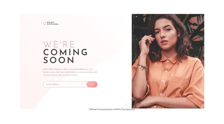
Design comparison
Solution retrospective
Hello everyone!
This project was pretty difficult to me for multiple reasons. I struggled with getting the desktop portion accurate due to not knowing if it was too big or not. constraining it further would cause the image to break out of the main container, which I had to deal with by constraining the image even further. It kinda feels like a hack to me that isn't supposed to be done regularly. Also, the colors would really throw me off due to how light they were. I made it to where the button wouldn't become active unless the user enters a valid email address so if you can't get the button to work, that's why.
I look forward to your feedback and suggestions
Michael Johnson
Community feedback
Please log in to post a comment
Log in with GitHubJoin our Discord community
Join thousands of Frontend Mentor community members taking the challenges, sharing resources, helping each other, and chatting about all things front-end!
Join our Discord
