Submitted over 4 years ago
Base Apparel using HTML CSS and bit of a JS.(Responsive)
@sijandahal
Design comparison
SolutionDesign
Solution retrospective
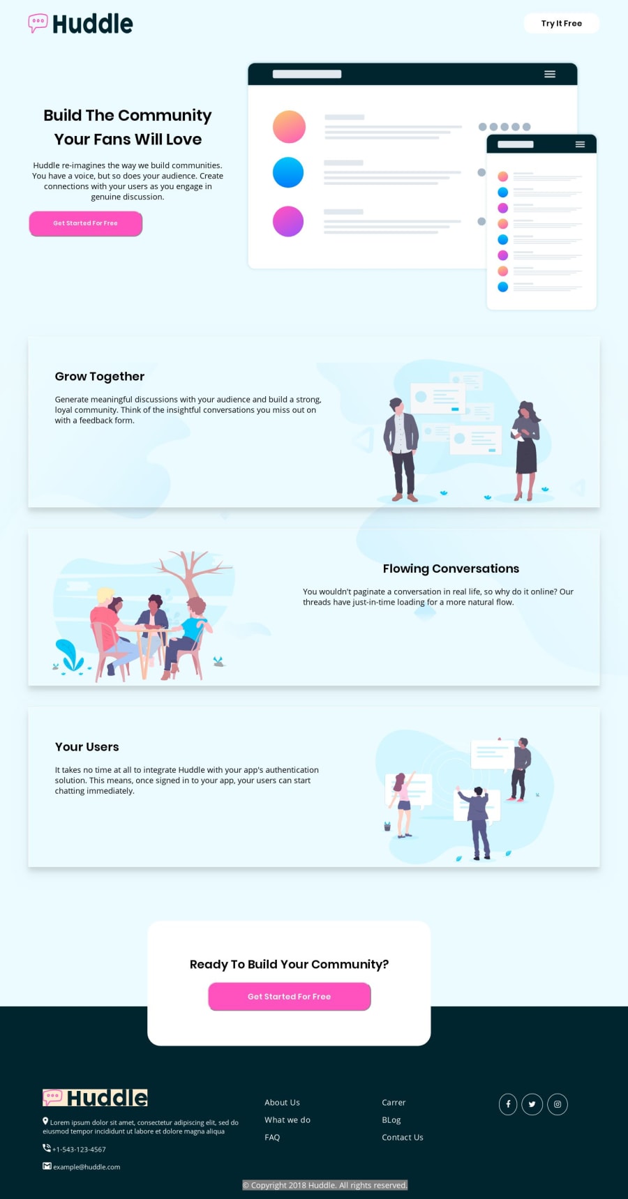
Hello Everyone, This is my fifth newbie project and this time around I've tried to make a full somewhat looking like a website adding responsiveness for all the widths and devices available.I used Grid and flex box in the project.
I would like to know how am I doing in all these stuff and also do rate this project with criticism and feedback, it will help me grow ! Furthermore you can also specify certain areas that I need to improve and my coding skills . :) Thank you !
Community feedback
- @DiarrahPosted over 4 years ago
Leaving a few pointers to hopefully help:
- Add align-items: center onto the top bar so that the logo doesn't stretch vertically.
- Use border: none on the buttons where you set a border-radius so you don't get that gray border. 3.You can change color of the actual SVG in the footer by opening it up in the file and change the fill color. 4.Give a set height+width to the <a> tags (social media logos) and then do a border-radius 50% so that they're all perfect circles.
- Light blue bg on the hero section only.
Hope to help, Diarrah
2@sijandahalPosted over 4 years ago@Diarrah Thank you tons ! Will definitely look into it.
1
Please log in to post a comment
Log in with GitHubJoin our Discord community
Join thousands of Frontend Mentor community members taking the challenges, sharing resources, helping each other, and chatting about all things front-end!
Join our Discord
