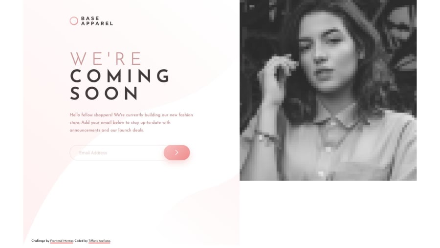
Design comparison
Solution retrospective
Not a question --
I kept the height and width to a fixed size for optimum visual. It was mainly to keep the photo from becoming pixelated on larger screens.
Community feedback
- @mattstuddertPosted about 5 years ago
Your solution for this challenge looks awesome Tiffany, great work! 💯
I noticed you're using
max-widthmedia queries in your CSS. Have you tried usingmin-widthqueries before and working in a mobile-first workflow? I often find that it actually reduces the amount of CSS I write and also has the added benefit of loading in fewer styles for mobile users. Could be worth a try on a future challenge!Keep up the great work! 🙂👍
1@yiranoPosted about 5 years ago@mattstuddert I'm going to make that change right now! Thank you so much! :D
0 - @AjeaSmithPosted about 5 years ago
Hey Tiffany, Awesome job on this! it scales very nicely and looks great. Keep up the good work :)
P.S - I really like how you organized your README file, it's the most important part of the code. I'm definitely taking notes on that :)
1@yiranoPosted about 5 years agoThank you @AjeaSmith! I've still got a long ways to go in that README file but I can never figure out what more to write.. haha
0
Please log in to post a comment
Log in with GitHubJoin our Discord community
Join thousands of Frontend Mentor community members taking the challenges, sharing resources, helping each other, and chatting about all things front-end!
Join our Discord
