Submitted about 1 year ago
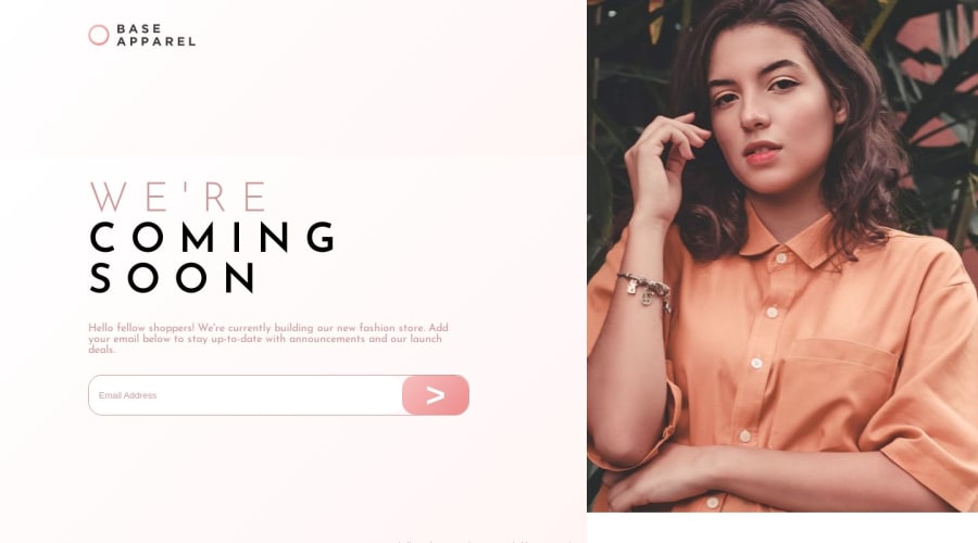
Base Apparel - Solution using HTML, CSS Grid and JavaScript
@LucasSauham
Design comparison
SolutionDesign
Solution retrospective
I started using FlexBox and CSS Grid recently. I want to improve on some points:
1 - The divs are changing position when clicking on the check email button 2 - I managed to put the TextField and the button together, however, the button is resizing as the error symbol appears. Also, when "opacity" is applied, it shows the border of the div.
I accept suggestions, thank you!
Community feedback
- @0xabdulkhaliqPosted about 1 year ago
Hello there 👋. Congratulations on successfully completing the challenge! 🎉
- I have other recommendations regarding your code that I believe will be of great interest to you.
COMPONENT MEASUREMENTS 📐:
- Use
min-height: 100vhfordiv class="grid-container"instead ofheight: 100vh. Setting theheight: 100vhmay result in the component being cut off on smaller screens, such as mobile devices in landscape orientation.
- For example; if we set
height: 100vhthen thedivwill have100vhheight no matter what. Even if the content spans more than100vhof viewport.
- But if we set
min-height: 100vhthen thedivwill start at100vh, if the content pushes thedivbeyond100vhit will continue growing. However if you have content that takes less than100vhit will still take100vhin space.
.
I hope you find this helpful 😄 Above all, the solution you submitted is great !
Happy coding!
Marked as helpful0
Please log in to post a comment
Log in with GitHubJoin our Discord community
Join thousands of Frontend Mentor community members taking the challenges, sharing resources, helping each other, and chatting about all things front-end!
Join our Discord
