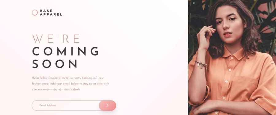
Design comparison
Solution retrospective
I'm just getting started with web development in general and haven't had a chance to learn JS much so i tried making everything possible using some sass mixins and other tricks. Would love to hear some feedback about the general stuff like did i get the font size right, did i nail the line height okay or maybe the way i positioned everything is right or not.
Community feedback
- @adarshcodesPosted over 4 years ago
Hi @Shubham Sharma, Welcome to the Frontendmentor community and congratulations on completing your first solution👍👍👍 Your solution looks nice but you can modify and take care of it from the next project.
So, let's started with your design-
- The design looks pretty good.
- There is a bit of change needed in the search bar:
1). Add padding-left to the search bar. So, while typing the text start with some distance from the corner of the box. 2). Change the input text-color to the same as the place holder text color. 3). You can change the background color of the Search bar to transparent so that it matches the main background and look more similar to design.
.form_input : { padding-left: 4rem; color: #DD959B; background: transparent; }4). Change the cursor hover effect to the pointer when the user hovers at the arrow button attached to the search bar.
.form__submit-btn { cursor: pointer; }About Responsiveness-
-You can add one breakpoint for responsiveness at 1056px, 700px, and at 480px around so that the responsive design will work great🙂
About Code-
-Your code is well organized and easy to understand. Great!👍
Accessibility and HTML issues-
-Solve the Accessibility and HTML issues that arose above🐱🏍.
Keep Coding Brother🐱💻
2@shubhamthedevPosted over 4 years ago@adarshcodes thank you for the corrections these small things just went right past me and i've corrected all the issues you've suggested.
1 - @nicm42Posted over 4 years ago
This looks really great. I love the way you've laid out your HTML, so it's really clear and easy to read. Similarly your SASS is easy to read and everything is labelled in such a way that I don't have to compare the scss and html files to work out what everything is referring to.
Just comparing the design images to your site by eye the things I noticed that are different are:
-
The line-height in your para class is bigger than on the design. But the font size looks the same to me.
-
On mobile the background image/gradient isn't showing up beneath the photo, but is in the background of the email input. But on desktop the background image/gradient is showing up except in the email input.
-
The submit button should be closer/over the input a bit more - in the design you can't see the right edge of the input box, but you can on your site. And on mobile it's even further away - and it's gone off the right edge of the screen.
-
And I also noticed that if you make the browser window narrow, the text on the left goes over the photo on the right.
1@shubhamthedevPosted over 4 years ago@nicm42 Hey hi, thanks for the feedback and i'll try improving upon the things you mentioned in your feedback.
0 -
Please log in to post a comment
Log in with GitHubJoin our Discord community
Join thousands of Frontend Mentor community members taking the challenges, sharing resources, helping each other, and chatting about all things front-end!
Join our Discord
