Design comparison
Solution retrospective
How can i improve this?
Community feedback
- @radomirjosifovicPosted over 2 years ago
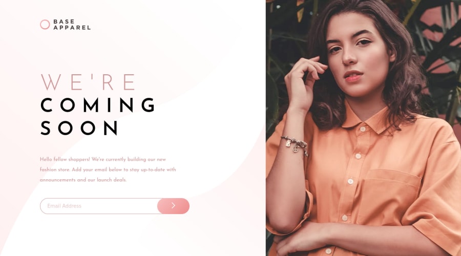
Excellent work on design mate. However, I noticed that you didn't add active states on your website, that you could do to complete this project in full. For example, when you focus on your input field, there should be an error icon with text thats says to provide a valid email adress. You will need to position that icon with position: absolute, to add correct measures, to add display: none and then on your element::focus, you should make it to display: block; and it will show itself. Also border (outline) on focus is soft red color in the project, but you left at #000;.
Marked as helpful0 - @guztrilloPosted over 2 years ago
Hey, Oyeyinka. Great Job! However, you can still made some improvements. First, review your report and fix your accessibility and HTML issues.
Also I noticed that you didn't add the background-gradient to the desktop view. And there's some problems with text, the text breaks when there's not enough space. You can try with a
min-widthproperty or changefont-sizewith media queries.I hope this help you!
0
Please log in to post a comment
Log in with GitHubJoin our Discord community
Join thousands of Frontend Mentor community members taking the challenges, sharing resources, helping each other, and chatting about all things front-end!
Join our Discord
