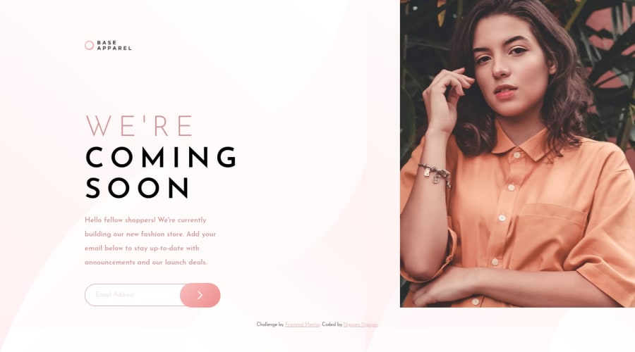
Base Apparel Page using HTML CSS and JS (grid & absolute position)
Design comparison
Solution retrospective
Hello, I've struggled a lot with this challenge. I have a few specific questions but also welcome any other feedbacks.
1- I use setTimeout so that the form is clear before the alert pops up, will there be any issue? If I use promise instead, how can I do this? Any other way that you guys did to clear out the form after successfully submitted?
2- I learned from someone else how to do this linear background but I'm still very confused about how to achieve it. Is there any good tutorial on this topic that you'd recommend? How do you just look at this background design and know which colors to use for the linear gradient?
This is my second project using JS. Your feedbacks will help me learn a lot so I hope to receive some comments on this project. Thank you in advance :D
Community feedback
- @besttlookkPosted almost 3 years ago
Hi, First of all congtratulations on completing this challenge. Tho there are few things you need to change which I am going to point out:
- When ever you use form rather that adding the eventListner on the submit-button add the eventListerner on the <form> element. When we click on button with type submit(that is very important) form automatically get submitted.
  <form  class="email-input-wrapper" id="form"> // no need to mention action
            <input
              id="user-input"
              name="email"  // with this we can extract the value of input.
            />
            <button type="submit" id="submit-button">
              <img src="images/icon-arrow.svg" alt="" />
            </button>
          </form>
const formEl = document.getElementById("form") formEl.addEventListner("submit", (event) => { event.preventDefault() ;// form has default behaviour of going to differnt url for submission. We need to avoid that const valueEntered = event.target.email.value ; // using the name to extract the value //DO ALL THE CHECKING HERE...ONCE EVERYTHING IS OKAY..YOU CAN CLEAR THE INPUT //FOR THAT YOU DONT HAVE TO USE ANY TIMER. JUST RESET THE VALUE LIKE THIS. event.target.email.value = "";- For gradient you can refer to https://www.w3schools.com/css/css3_gradients.asp or https://developer.mozilla.org/en-US/docs/Web/CSS/gradient/linear-gradient
Feel free to drop a mesg incase you need any help. I am no expert but will try to help you out
Good Luck,
Happy Coding
Marked as helpful2@jesuisbienbienPosted almost 3 years ago@besttlookk I have modified my codes as per your suggestion and it works wonderfully. Thank you for your feedback!
0 - @shashreesamuelPosted almost 3 years ago
Hey good job completing this challenge
Keep up the good work
Your solution looks great however I think that the logo is a bit too small. Secondly the description is supposed to wrap by the keyword "our" to look like the design.
I hope this helps
Cheers
Happy coding 👍
Marked as helpful1@jesuisbienbienPosted almost 3 years ago@TheCoderGuru I'll consider the styling again and make changes if needed. Thank you for your feedback. Happy coding!
0 - @vanzasetiaPosted almost 3 years ago
Hi, Nguyen! 👋
It's great to see you submitting another solution! 👏 Good effort on this challenge! 👍
Regarding your questions.
- For me, I used the Netlify form. So, when the user submitted their email, there will be a "Thank you" page and inside it, there's a link to go back to my site. Then, once the user goes back the email input has been cleared. So, if I would do it by myself, I would probably clear the input by setting the value to an empty string and adding a pop-up that says "Thank you for submitting your email!".
- If I don't have the design file, I would just probably use a solid background because I think it is hard to measure the color for the gradient background. However, I use this
linear-gradient(135deg, white, #fff5f5)code. So, you can just copy-paste it if you want. Regarding the learning resource, I would recommend reading the MDN documentation and/or CSS Trick articles about gradients.
I recommend adjusting the breakpoint for the media query, it's too late to change the layout into desktop layout on 1440px.
I would highly recommend never using inline CSS in JavaScript. It's best to always use CSS classes to style different states. For example, you can have
is-invalidclass in your CSS to style any element that is invalid. So, in JavaScript you can add and remove theis-invalidclass based on different conditions.That's it! Happy coding! 😁
Marked as helpful1@shashreesamuelPosted almost 3 years agoJust a follow up from Vanza's point of the learning resource, here is the MDN link
I hope this helps
Cheers Happy coding 👍
2@jesuisbienbienPosted almost 3 years ago@vanzasetia Thank you for your feedback. I'll definitely check out the links.
0
Please log in to post a comment
Log in with GitHubJoin our Discord community
Join thousands of Frontend Mentor community members taking the challenges, sharing resources, helping each other, and chatting about all things front-end!
Join our Discord
