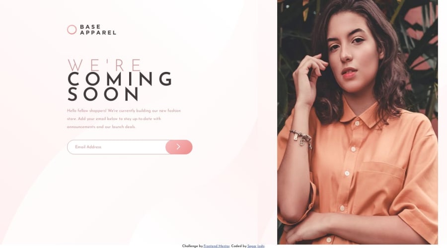
Design comparison
SolutionDesign
Solution retrospective
I tried to put icon-error.svg when email is invalid but it was messing up everyting. please provide your feedback, not proud of what I was able to create but still learn a lot...
Please log in to post a comment
Log in with GitHubCommunity feedback
- @VickyAzola
Hi! Great work finishing this challenge! I tried to put the icon using your code, and this is what I came up with.
- First on the HTML i added the <svg> with an id and class, and I also added a class for the image on the button:
<div class="input-wrapper"> <input type="text" class="text-input" placeholder="Email Address"> <svg id="error-icon" class="error-icon" xmlns="http://www.w3.org/2000/svg" width="24" height="24"><g fill="none" fill-rule="evenodd"><circle cx="12" cy="12" r="12" fill="#F96464"/><path fill="#FFF" fill-rule="nonzero" d="M13.256 6v9.056h-2V6h2zm-.944 12.464c-.384 0-.699-.104-.944-.312a1.027 1.027 0 0 1-.368-.824c0-.33.125-.608.376-.832.25-.224.563-.336.936-.336.373 0 .68.112.92.336.24.224.36.501.36.832 0 .341-.117.616-.352.824-.235.208-.544.312-.928.312z"/></g></svg> <button class="email-button"> <img class="btn-img" src="images/icon-arrow.svg" alt=""> </button> </div>- Then for the CSS styled the .error-icon class like this:
.error-icon { position: absolute; display: none; right: 63%; top: 15%; }- Modified the .email-button:
.email-button { background: linear-gradient(135deg, hsl(0, 80%, 86%), hsl(0, 74%, 74%)); width: 70px; height: 45px; border: 0; border-radius: 30px; cursor: pointer; position: absolute; left: 39%; }- I added the .btn-img class with some padding to center it and changed the color of the .error-message to red:
.btn-img {
    margin-left: 40%;
}
#error-message { position: relative; font-family: 'Josefin Sans'; font-size: 75%; padding-left: 3%; color: hsl(0, 93%, 68%); margin-top: 8px; }- Lastly, for the javascript, I changed the border to 1px (so the input doesn't change size when clicked) and added the errorIcon variable:
line 9 const errorIcon = document.getElementById("error-icon") line 13 emailInput.style.border = '1px solid hsl(0, 93%, 68%)' line 16 errorIcon.style.display = "block" line 20 errorIcon.style.display = "none"- I also added an event listener to the emailimput variable, so when clicked, the error disappeared.
line 25   emailInput.addEventListener("click", () => {
                   errorIcon.style.display = "none"
                   errorMessage.style.display = 'none';
                   emailInput.style.border = '0.5px solid hsl(0, 36%, 70%)'
               })
Hope this helps!
Marked as helpful
Join our Discord community
Join thousands of Frontend Mentor community members taking the challenges, sharing resources, helping each other, and chatting about all things front-end!
Join our Discord
