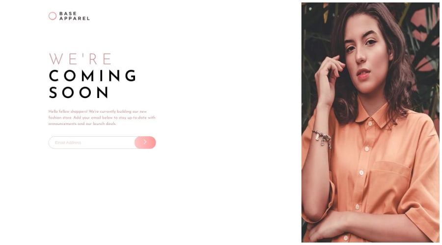
Design comparison
Solution retrospective
Any ideas on how to change the desktop's image to the mobile design's image? I'm guessing that is not the best way to do it. So, any ideas on how to improve it would be appreciated.
Community feedback
- @momorocks111Posted about 1 year ago
The way I did it with to logo is using two image tags. One for the desktop view and one for the mobile view. USing media queries, depending on the size of the screen, it will have display:block on one of the images and a display: none; on the other. For example:
.logo__mobile { display: block }
.logo__desktop { display: none; }
In the desktop view, it would be like this:
@media screen and (min-width: 1023px) { .logo__mobile { display: none; } .logo__desktop { display: block; } }
Hope that helps :)
Marked as helpful0@AshongAbdallah06Posted about 1 year agoThanks @momorocks111. This should be very helpful
0
Please log in to post a comment
Log in with GitHubJoin our Discord community
Join thousands of Frontend Mentor community members taking the challenges, sharing resources, helping each other, and chatting about all things front-end!
Join our Discord
