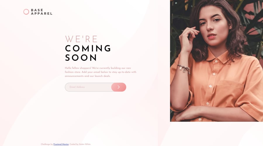
Base Apparel coming soon using dom manipulation and flex positioning
Design comparison
Solution retrospective
Definitely ran into some challenges with this one that discouraged me and slowed my progress. The first was in correctly positioning the main image since the mobile and desktop versions seemed to be placed in different spots per the design specs. Since using the <picture> tag seems to be a better practice to having two different <img> tags, I used media queries to affect the size, margins, and/or positioning of certain elements & containers to achieve the desired result. Though I'm satisfied with how it turned out, I wonder about best practices in this case.
I also got very slowed down and frustrated in validating the email input since most of my practice projects don't involve Javascript. Took a lot of googling but I found and utilized solutions that I'm very satisfied with. Overall, I'm happy I overcame this challenge and feel like I learned some valuable techniques from having completed it :)
Community feedback
- @k-stopczynskaPosted about 2 years ago
Hi!
Congratulations on finishing the challenge!
You did good job with JS part of validation but please consider that if you share your code on a forum it needs to be cleaned up. Especially if you use such colorful console.logs: DDDD you wouldn't want to share this with someone who would want to hire you.
I would also try not to style anything through JS. It may cause problems in the future because JS styles overwrite CSS styles and it's hard to find in bigger projects. In JS add some class and style this class in CSS.
I would also try to improve responsiveness and get some layout for tablet version and screens bigger than 1440px.
Also fix links in documentation. I know it's a small project but it's a good habit to have (still working on it: D).
Overall good job, you overcome the problems, learn how to search for solutions and get very close to the design:)
Happy coding!
Marked as helpful1@JudasThePriestPosted about 2 years ago@k-stopczynska Oh my god, I totally thought I cleaned that console.log up...going to do so right now.
EDIT: Change is committed through github. Rather embarrassed about that...
0@JudasThePriestPosted about 2 years ago@k-stopczynska Regarding the rest of the feedback: the Javascript & CSS classes makes sense. I suppose what I did is more akin to inline styling.
What documentation are you referring to? In all likelihood this is something I've never learned about up to this point.
0@k-stopczynskaPosted about 2 years ago@JudasThePriest documentation for your project is your README. It's good to make a habit out of preparing one for each project.
Marked as helpful1
Please log in to post a comment
Log in with GitHubJoin our Discord community
Join thousands of Frontend Mentor community members taking the challenges, sharing resources, helping each other, and chatting about all things front-end!
Join our Discord
