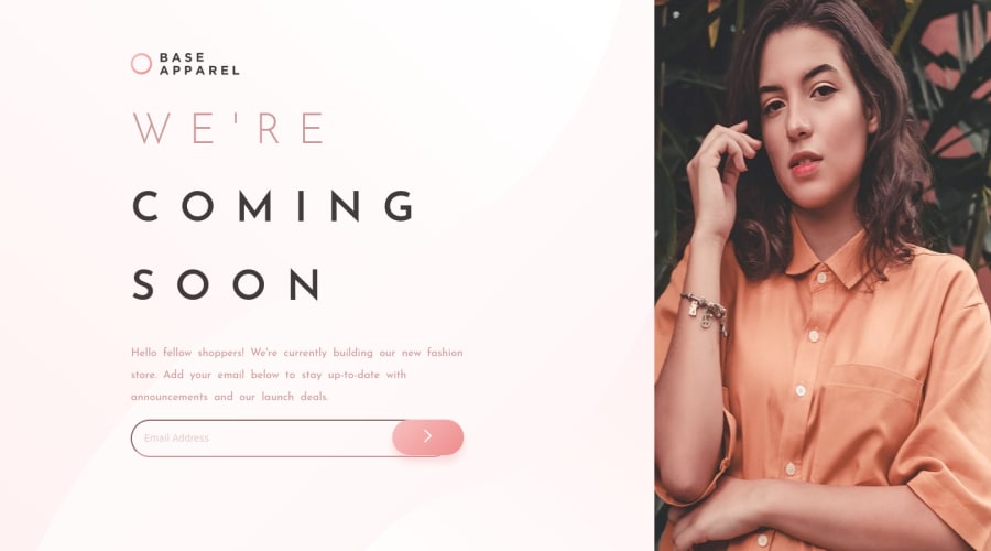
Base Apparel Coming Soon Solution using HTML, CSS, and Javascript
Design comparison
Solution retrospective
Took me a little more than a month to finish this project because I was learning JavaScript at the same time. I also realized a little too late while building this site that I should always start with mobile design first before doing desktop. I struggled a lot during this project especially trying to get my error popup message to appear, but it was fun and I learned a lot. Any suggestions, tips, and tricks, to improve my code are welcome.
Community feedback
- @vanzasetiaPosted almost 3 years ago
👋 Hi milessteamaccount!
🎉 Congratulations on finishing this challenge! If you think this challenge is too hard, then I would recommend doing the easier challenges first (without the JavaScript). However, I have some feedback on this solution:
- Accessibility
- All the page content should live inside landmark elements (
header,nav,main, andfooter). By using them correctly, you can make users of assistive technology navigate the website easily. In this case, you can wrap all of it withmaintag.
- All the page content should live inside landmark elements (
<body> <main> page content goes here... </main> </body> Note: I only see the closing tag (</main>).- Alternative text for images should not be hyphenated. It should be informative and human-readable. In this case, the alternative text for the logo should be the company name (Base Apparel). Also, since it is inside the
aelement, the alternative text would be "Base Apparel - Home". - Wrap the
WE'RE COMING SOONsentence in oneh1. It only makes sense if they read together.
<h1><span>we're</span> coming soon</h1>- Also, in addition to the previous feedback, you should use CSS to make the text uppercase. Only manually uppercase a word if you want it to be spelled (like an acronym).
- The
inputelement should have atypeofemail. - The submit button should have
typeofsubmit. - For the error icon, you can use
backgroundproperty on theinputelement. - Add
aria-describedby="error-popup-message"to the input element. - For the hero image, I would recommend using either
backgroundproperty or pseudo-element. - Use
remor sometimesemunit instead ofpx. Usingpxwill not allow the users to control the size of the page based on their needs. - JavaScript
- I would rather listen for the
submitevent instead of the click of the submit button and separate thefunctionfrom the event listener.
- I would rather listen for the
const form = document.querySelector(".email-address-form"); form.addEventListener("submit", submitEmail)- Best Practice (Recommended)
- Validate your HTML before you submit your solution. Currently, it has one issue.
- Write your code with a consistent style, specifically the indentation.
You can check my solution and try to understand how I did the validation. If you don't understand certain things, feel free to ask me the questions.
That's it! Hopefully, this is helpful!
Marked as helpful1 - Accessibility
Please log in to post a comment
Log in with GitHubJoin our Discord community
Join thousands of Frontend Mentor community members taking the challenges, sharing resources, helping each other, and chatting about all things front-end!
Join our Discord
