Design comparison
Solution retrospective
Any feedback would be appreciated.
If anyone could explain how to remove the default validation error message that is displayed on submission, then I'd be very grateful!
Community feedback
- @ApplePieGiraffePosted almost 4 years ago
Hey, nice job, Chris! 👍
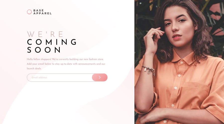
Your solution looks good and responds nicely! I like how the hero image is cropped and doesn't distort when the page is resized (something some forget to make sure of in this challenge). 👏
This is a small suggestion, but the heading overflows into the image to the right of the page just before the layout changes at 600px, so you might want to have the layout switch slightly sooner to avoid that issue. 😉
Keep coding (and happy coding, too)! 😁
1 - @brasspetalsPosted about 4 years ago
Hi, Chris! 👋 Good job on this challenge!
I kept the default validation error, but here's a discussion on different ways to change it. However, I'm not sure how much you can style it.
To fix the errors in your report, just add aria labels to your input and button.
My only other suggestions would be adding a max-width to your text-container so things don't get too stretched on large (ex: 1920px) screens. You might also want to up your media query to something closer to 700px. Right now from 600px to about 650px, the image starts overlapping your heading.
Happy coding!
1@Chris94LeePosted about 4 years ago@brasspetals Thank you so much for the feedback, I'll take a look at making those changes now.
1
Please log in to post a comment
Log in with GitHubJoin our Discord community
Join thousands of Frontend Mentor community members taking the challenges, sharing resources, helping each other, and chatting about all things front-end!
Join our Discord
