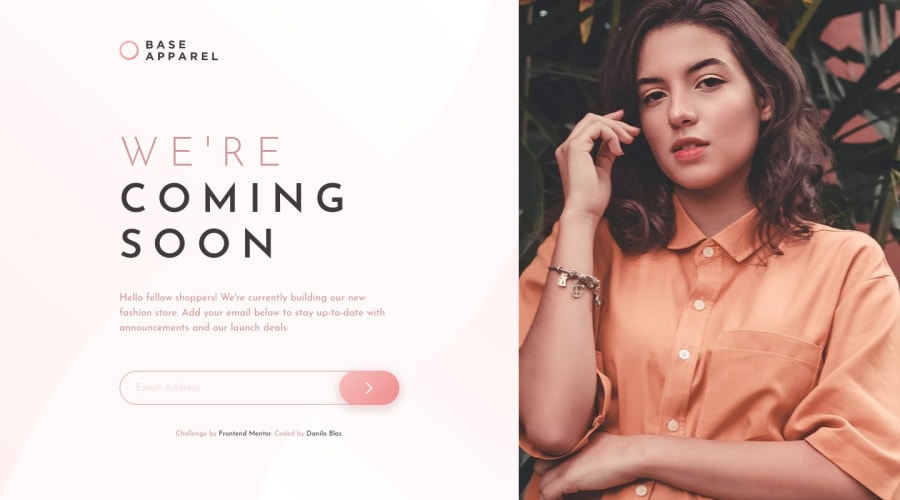
Base Apparel Coming Soon Page with only CSS and Vanilla JS
Design comparison
Solution retrospective
This challenge was difficult for me because I don't like to make forms, but a frontend developer must know how to work with them. For validation I did it my way as I have seen that there are many solutions but I think it works pretty well.
Any recommendations are welcome.
Note: I'm going to take a break from doing challenges for a few months due to college classes and work, but I'll be advising those I can in the community :D
Community feedback
- @SamadeenPosted almost 3 years ago
Hey Danilo!! Cheers 🥂 on completing this challenge.. .
Here are my suggestions..
You did perfectly well in my opinion.. Just one little detail set your button on active state to outline :none; to get rid of that black border.
e.g button:active{ outine: none;}
. Regardless you did amazing... hope you find this useful... Happy coding!!!
1@Sdann26Posted almost 3 years ago@Samadeen thanks for the comment although I don't know which outline you are referring to or can you tell me in which class I should add it since I don't see black border, I'm sure it's not the shadow that I added to the button or maybe it's seen in another browser and I didn't notice it D:
0@SamadeenPosted almost 3 years ago@Sdann26 when you click your button to submit there is a black border around your form__button to fix that you can say
.form__button:active{ outline: none }
1 - @Kamasah-DicksonPosted almost 3 years ago
Your solution looks great and responsive on smaller devices also. Besides I shall see you on the other side, am also schooling and I have just 5months👍😀
1
Please log in to post a comment
Log in with GitHubJoin our Discord community
Join thousands of Frontend Mentor community members taking the challenges, sharing resources, helping each other, and chatting about all things front-end!
Join our Discord
