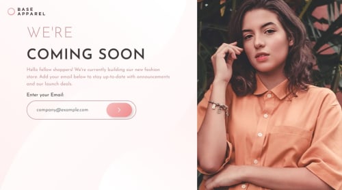
Base Apparel Coming Soon page with Email Validation and CSS grid

Solution retrospective
This is the third time I've completed a project with email validation. This one seemed easy when I looked at the preview images. But, it turned out to be a little confusing from the responsive side of the website.
Built with:
- HTML
- CSS
- JS
- Validator.js
It was easy to create the error states with messages and icons. I'm proud of not doing lots of googling and instead just going through an MDN article to get help with the order of the grid on mobile screens.
As I said, making this website responsive was a bit of a challenge mainly because the image used to break when I shrunk the browser window.
I also found it a little hard to create the form. Adjusting the padding and width of the form took a lot of time and work. The form icons also disappeared when I switched to a small screen. I had to re-write and add lots of code to fix it. I'm still not very confident if it looks good on smaller screens.
Thankfully, the Validator.js library took care of the email input.
What specific areas of your project would you like help with?I would like to get recommendations on how I can improve my code and also the responsiveness of the website. Let me know if it works correctly on your devices!
As always, any suggestions are welcome! 😇
Please log in to post a comment
Log in with GitHubCommunity feedback
No feedback yet. Be the first to give feedback on Tharun Raj's solution.
Join our Discord community
Join thousands of Frontend Mentor community members taking the challenges, sharing resources, helping each other, and chatting about all things front-end!
Join our Discord