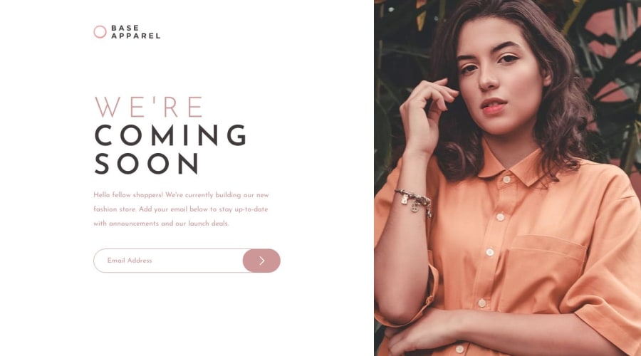


Design comparison
SolutionDesign

Solution retrospective
feel free to give any suggestion on any parts of the design.
Community feedback
- @lack21Posted almost 2 years ago
Good job 👍, but I have a some recommendations!
- Remove this
html, body {
  height: 100%;
}
html and body by default will take maximum space available, so
height: 100%does nothing here, but if you want to feel secure I recommend you to addmin-height: 100vh, like this body always will be either100vhin height or more, but never less than100vh!- Replace
height: 100vhtomin-height: 100vhin the.grid, the difference is that, when you setheight: 100vhto something, that means it won't be bigger than that, it might cause some problems in the future, so better approach is to setmin-height: 100vh, like this in case content is overflowing container will adjust to it!
Marked as helpful1 - @0xabdulkhaliqPosted almost 2 years ago
Hello there 👋. Congratulations on successfully completing the challenge! 🎉
- I have other recommendations regarding your code that I believe will be of great interest to you.
iMAGE SHRINK 📸:
- The image for desktop version is being disorted when the user minimizes or maximizes their device viewport, this issue can be cleared by using
object-fitproperty in css
- So just add this following style rule which helps you to efficiently adopt your image to behave well on any screen sizes
img {
  object-fit: cover;
}
.
I hope you find this helpful 😄 Above all, the solution you submitted is great !
Happy coding!
Marked as helpful0


Please log in to post a comment
Log in with GitHub
Join our Discord community
Join thousands of Frontend Mentor community members taking the challenges, sharing resources, helping each other, and chatting about all things front-end!
Join our Discord