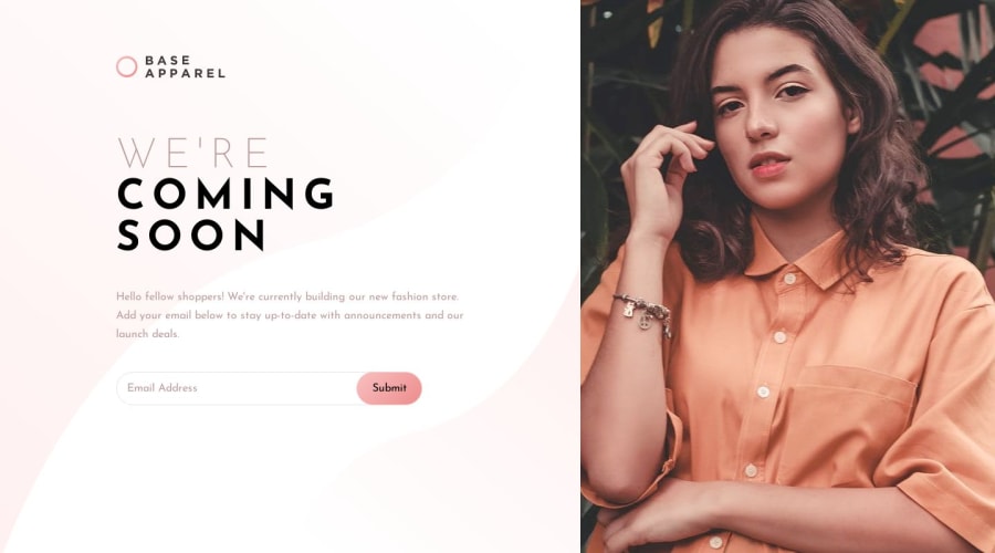
Base Apparel Coming Soon Page Using CSS and Flexbox
Design comparison
Solution retrospective
Please review. I need your honest criticism
Community feedback
- @DiarrahPosted over 4 years ago
This was a great start. Some tips:
- Easy way to get over that accessibility issue is to wrap it in a label tag.
- I would make the picture position: sticky then stick it to the right so that the height isn't an issue.
- The 2 input fields don't need value attributes. Just make it say placeholder="Email address..."
- This project was supposed to use JS for the email validation.
1@thisisobatePosted over 4 years ago@Diarrah Thanks alot for your honest feedback. This feedback is really helpful. I really appreciate.
1 - @mattstuddertPosted over 4 years ago
Nice work on this challenge! Diarrah has given you some great pointers. I'd also recommend going through the CSS one more time matching your solution up to the design to try and get your project as close to the design as possible. Accuracy is a key part of being a front-end developer, so it's a skill that's well worth taking some time to build. Your overall layout looks great, it's just that a few things are off, like
font-sizeandfont-weight.Keep up the great work! 👍
0@thisisobatePosted over 4 years ago@mattstuddert Wow!! I'm speechless already! Thanks alot Matt for your honest reviews. This was helpful
0@mattstuddertPosted over 4 years ago@thisisobate no problem at all! If you ever have any questions, just let me know 🙂
0@thisisobatePosted over 4 years ago@mattstuddert Alright. Would definitely do that.
0
Please log in to post a comment
Log in with GitHubJoin our Discord community
Join thousands of Frontend Mentor community members taking the challenges, sharing resources, helping each other, and chatting about all things front-end!
Join our Discord
