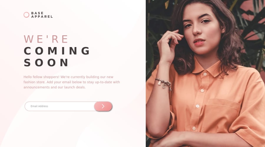
Design comparison
SolutionDesign
Solution retrospective
I'd really appreciate feedback and contribution (as well as criticisms) on this project. Especially on the image height on different screen sizes.
Thank You!
Community feedback
- @0xabdulkhaliqPosted over 1 year ago
Hello there 👋. Congratulations on successfully completing the challenge! 🎉
- I have other recommendations regarding your code that I believe will be of great interest to you.
BUTTONS 🖲️:
- This solution had generated accessibility error reports due to lack discernible text for
<button>
element
- The
<button>
must have discernible text that clearly describes the destination, purpose, function, or action for screen reader users.
- Screen reader users are not able to discern the purpose of elements with role="link", role="button", or role="menuitem" that do not have an accessible name.
- The
<button>
name rule has five markup patterns that pass test criteria:
<button id="al" aria-label="Name"></button> <button id="alb" aria-labelledby="labeldiv"></button> <div id="labeldiv">Button label</div> <button id="combo" aria-label="Aria Name">Name</button> <button id="buttonTitle" title="Title"></button>
-
Ensure that each
<button>
element and elements withrole="button"
have one of the following characteristics:- Inner text that is discernible to screen reader users.
- Non-empty
aria-label
attribute. aria-labelledby
pointing to element with text which is discernible to screen reader users.role="presentation"
orrole="none"
(ARIA 1.1) and is not in tab order (tabindex="-1"
)
.
I hope you find this helpful 😄 Above all, the solution you submitted is great !
Happy coding!
0
Please log in to post a comment
Log in with GitHubJoin our Discord community
Join thousands of Frontend Mentor community members taking the challenges, sharing resources, helping each other, and chatting about all things front-end!
Join our Discord