Not Found
Not Found
Not Found
Not Found
Not Found
Not Found
Not Found
Not Found
Not Found
Not Found
Not Found
Not Found
Not Found
Not Found
Not Found
Not Found
Not Found
Not Found
Not Found
Not Found

Submitted

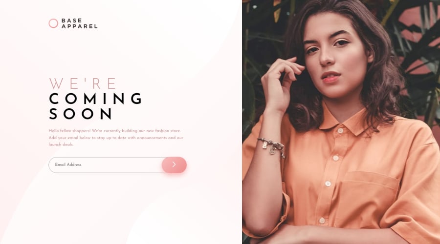
Base Apparel Coming Soon Page - SCSS with Desktop-first workflow

Pon Huang 210

@ponhuang

Desktop design screenshot for the Base Apparel coming soon page coding challenge

This is a solution for...

  • HTML
  • CSS
  • JS
1newbie
View challenge

Design comparison


SolutionDesign

Solution retrospective


This is quite challenge me to understand the email validation in JavaScript and the hero-img. Until now I still couldn't figure out how to solve the issue of background image and hero-img size in desktop and mobile device. :(

I will appreciate that if you can give me any advice or idea to make this solution better.

Community feedback

@Ahmed96Mah

Posted

@ponhuang

Hello, Pon :)

Ok, to make the layout more similar to the design, I used flex-box which is much...much easier.

Note: Always remember to add node_modules folder to the gitignore file because of its size.

So, instead of writing a long review with the modifications, I will link the modified code and mention the most important points in it:

1- This is a modified version of your code on google drive. You should ignore (__MACOSX) folder.

Note: I have ONLY commented out the lines that I didn't need and wrote my modifications directly below each block so that it would be more easy for you to notice the changes.

2- The most important notes are:

  • I added a div container inside of the header (with a class of 'mainDiv') which includes: logo image, mobile hero image (this is new) & hero__info div.
  • Each of header (with class hero) & 'hero__info' div layout rules has been changed to use flex-box instead. Which means that, all grid properties for all elements in the page has been commented out (since we don't need it when we use flex-box).
  • background property was used on the main container div (that I added to HTML) instead of being used on body. Since you could notice from design files that the hero image doesn't crop any portion of the background picture.
  • I changed mobile layout using flex-box as well
  • The last thing, the added mobile hero image has a property of display set to none (for desktop styles in _layout.scss).
#mobileImage { 
display: none;
}

However, this gets overridden by the mobile styles (in _media.scss) with:

#mobileImage { 
display: block;
width: 100%;
}
&__img {
      display: none;
}

For the e-mail validation, I replaced the regex (regular expression) with what I believe to be a better one, which I found from one of Adriana's solutions.

It is shorter, in case you find it difficult to understand, this is its meaning:

const regexEmail = /^\w+([\.-]?\w+)*@\w+([\.-]?\w+)*(\.\w{2,3})+$/;
// ^ this symbol represents beginning of input
//  \w  this means any upperCase character, lowerCase character, number or underscore
//  +   means: one or more characters
// ([\.-]?\w)  means, a dot '.' or hyphen '- '.  ('?' means: but there must be a character after it)
//  *   means: zero or more combinations of ([\.-]?\w)
// @\w+  means: @ and one or more characters after it
// (\.\w{2,3})+$  this means at the end, there must be a dot, then, 2-3 characters like .com, .eg, uk or .net
// $ this represents end of the input

Today, i used the following links to understand how to use regular expressions with match:

Note: there are other smaller style properties which was added to the hero image, hero_info div and so on just to resize the elements.

Hope this helps :)

If you have any questions, don't hesitate to ask. Really :)

Have a nice day.

Marked as helpful

1

@Tuason066

Posted

Hi 👋 @Ahmed96Mah,

I want to ask how parenthesis ( ) works. If square brackets [ pattern ] work with any characters that are in the pattern will return true

i.e.

const string = 'Hello World!';
const test = /[o]/.test(string); // this will return true because **o** exist

How parenthesis ( ) works? 😅

Thank you so much for responding 🙏 Happy Coding!!! 😊

0
Pon Huang 210

@ponhuang

Posted

@Ahmed96Mah

Thank you so much, the first time was using flex, but no idea why that time couldn't figure out how to make it work. But now it seems easier using this way than grid.

Would you mind telling me what are the difference among 100vh/ 100% /auto setting to a width or height?

In the body section, you use min-height: auto; I am not quite sure is there any difference between other 100% or 100vh.

And if we use 100 value, does it mean no need to set min or max to width or height?

And the last question, my error icon is overflow when the screen size around 700px - 800px, in this case does it matter to fix it? If so, how can I do?

Btw, the Regular expression for email validation is really easier to understand :D

Oh and I haven't learned all the JavaScript yet, it is a bit frustrated cannot fully understand or know how to learn better in JS.

Thanks again, you really save my day :) Have a nice day~

0

@Ahmed96Mah

Posted

@Tuason066

Hello Jeffrey,

So, first of all, we used match (which gets called on the string itself) which is different from test (that gets called on the regex). I am just making sure to mention this to avoid any possible confusion.

So, in my previous answer to @ponhuang, I forgot to mention them. They are literally used to separate expressions in the following manner:

For example, you want to say: "match any dot '.' or hyphen '-', ONLY if one or more characters come after them". AND you also want to say: "allow this to be repeated zero or more times".

// So, if you just write the following 
const regex = /[\.-]?\w+*/;
// Where [\.-]?\w+     means allow dot or hyphen only if one or more characters comes after them (where + means one or more)
// And where * means (zero or more times)
// You will actually get AN ERROR which say the following
Uncaught SyntaxError: Invalid regular expression: /^[\.-]?\w+*$/: Nothing to repeat

But if you wrap the pattern around parenthesis as follows:

const regex = /([\.-]?\w+)*/;
// This will work just fine.

Now, what I forgot to mention is that using parenthesis also work as a memory device by literally memorizing the number of occurrences in which the regular expression happened and also where it did happen. That will have an effect on memory usage of course. So, to solve that you should add the 'g' flag (at the end of regex) in the following manner:

const regexEmail = /^\w+([\.-]?\w+)*@\w+([\.-]?\w+)*(\.\w{2,3})+$/g;

When you use 'g' flag (according to docs on MDN):

"only the first complete match and its related capturing groups are returned".

These articles on MDN should help you understand this more:

-Groups and backreferences

-string's match method

Hope this helps.

Have a nice day :)

Marked as helpful

0

@Ahmed96Mah

Posted

@ponhuang

Hello, Pon :)

Ok, so the difference between 100vw, 100% & auto is the following:

1- vw means viewport width (or screen width). So, if you say:

.container {
width: 50vw;
}

This will make the element with class container to have a width which is half of the viewport width (or screen width).

The same for vh which means viewport height (or screen height):

.container {
width: 50vh;
}

This will make the element with class container have a height which is half of the viewport height (or screen height).

2- % means the available space:

So for example, in the modified code, I added the following for header tag:

.hero {
// (line 7 in _layout.scss)
width: 100%;   
}

This will set the width of the header to all the available free space on the screen. I said free because, if there is another element next to the header (for example) and it has a width of 25vw (which means that, it will have a quarter of the page's width).

This will make the header's width equivalent to three-quarters of the page's width. Because all the remaining screen width (after subtracting 25vw (or a quarter of page's width) ) is three-quarters.

However, If we used the following with the header:

.hero {
// (line 7 in _layout.scss)
width: 100vw;   
}

This will set the width of the header to a constant value equivalent to device's screen width. That might be Okay in our case, but, if you imagined the same scenario again (where we have a neighbor element, with width of 25vw, next to the header).

This will make the body's width (125vw) which will make a horizontal scrollbar appear at the bottom of your page (which is not good).

NOTE: the above is also true when you compare % and vh. But the overflow (if it exists) will be vertically. However, for % to be used with height property, you must explicitly set a height value for the parent element. So that % can know how much (available space there is).

That is why inside the header, I set the width of 'mainDiv' to 45%, and also set width of desktop hero image to 42.5%. When you add this to main's padding left (5.5%) and padding right (7%), this will result in:

mainDiv's width = 42.5% + 5.5% + 7% = 55%

image width = 45%

and total header's element width = 55% + 45 % = 100%

which will ensure the header is responsive and also ensures that mainDiv and image will not spill out (or get out) of the header.

3- Auto is similar to 'fit-content' value, which makes the element's width or height fit the actual content inside it (with no extra space).

About your point of using 100 with min or max:

Using 100% or 100vh or 100vw doesn't mean that you don't have to use min and max. So, for example:

  • if you say min-height or min-width: 100%. This means the minimum height/width for an element is 100% of available free space (even if the element doesn't need that space ).

  • if you set an element to have a max-height: 100vh. The content inside that element might need more vertical space (height) to display its content correctly. like this page we are in right now. It has height more than 100vh (because you can scroll through it). So, you can't set it to have a max-height: 100vh. But you can say min-height: 100vh, to ensure that the page takes at least all of the screen.

  • if you say max-height or max-width: 80%. This means the maximum height/width for an element is 80% of available free space (even if the element does need more space ). Be careful that, if you choose a height value which isn't enough for the element, this will make the element spill out of its container.

And for error icon, since that problem doesn't happen except for width between 700px-800px you could make another media query below the existing one to override it as follows:

/*---------- 860px ----------*/
//after the media query you already written
@media (max-width: 53.75em) {
...
}
// you can add this 
/*---------- 700px to 860px ----------*/
@media (min-width: 43.75em) and (max-width: 53.75em) {
.error-icon {
left: 55%;  // this changed left value from 70% to 55% 
}
}

Take a look at the following articles:

-CSS values and units

-percentage

Hope this helps.

If you have other questions or If you didn't understand any of the points we talked about. Don't hesitate to ask again.

Have a nice day :)

Marked as helpful

1
Pon Huang 210

@ponhuang

Posted

@Ahmed96Mah

Hello Ahmed :)

Thanks a lot, I was trying to understand the spacing and units. In this case, after this explanation, now I got it. However, after doing this challenge then I am confused again. :(

Couldn't figure out why the content is not center and I have to give it a padding. And how to look exactly the same as the demo? This is tricky as well.

The other question, in this challenge, is there any possible we can align the placeholder and error icon to vertical align them to middle? Cause the error-icon is position to absolute, so I think it might not able to do any align in this case. But not sure is there anyway can do it better.

Thanks for helping and being patient :) Have a great day~

0

@Ahmed96Mah

Posted

@ponhuang

Hello, Pon :)

You are welcome.

Ok, To manage the position of the error icon, you can do the following:

1- First of all, delete the second media query which I asked you to add in _media.scss. Which was as follows:

/*---------- 700px to 860px ----------*/
@media (min-width: 43.75em) and (max-width: 53.75em) {
.error-icon {
left: 55%;  // this changed left value from 70% to 55% 
}

So, we don't need that anymore. Instead, we would do the following.

2- changed the arrangement of elements inside 'email__container' div (in index.html) to be as follows:

  • Input element first.
  • Then, error icon.
  • Then, the button.

So, it will look like this:

<div class="email__container">
   <input
      id="email"
      type="email"
       placeholder="Email Address"
       class="email"
    />
    <img
       src="images/icon-error.svg"
       alt="error icon"
       class="error-icon"
   />
   <button class="btn btn-submit" type="submit">
       <img src="images/icon-arrow.svg" alt="Arrow Icon" />
    </button>
</div>

3- Then, you would do the following changes (to form styles in _layout.scss):

.email__container {
flex-flow: row nowrap;   // this line is added to the styles
}
.error-icon {
margin-right: 7rem;     // this line is added to the styles
margin-left: -11rem;    // this line is added to the styles

//position: absolute;        // this line is removed (commented out)
//top: 50%;        // this line is removed (commented out)
//left: 70%;        // this line is removed (commented out)
//transform: translate(-50%, -70%);        // this line is removed (commented out)
}

So, what we did is the following:

  • Used flex row in the 'email__container' div
  • Used margin left and right to position the error icon on the left of the button (and now it will be centered vertically, and it will also maintain its position without having to use position: relative)

And by the way, you can also add this line to the 'email' class styles:

.email {
background-color: transparent;
}

To be more close the design.

Hope this helps :)

Do you still have a problem with your new challenge?

Because I have seen that you received some feedback. If you still having problems, tell me and I would give it a look as soon as I could.

Have a great day :)

Marked as helpful

1
Pon Huang 210

@ponhuang

Posted

@Ahmed96Mah

Hello Ahmed ~

This is much easier and better code, amazing. 🥳 Thanks a lot :D

For the other challenge, yes Elaine helps me the input issue. The rest issue I found is the space upon the top and bottom. As I know that we use

body{
  display: flex;
  flex-direction: column;
  align-items: center;
  justify-content: center;
}

to let the content align to center. But not quite sure why, this time it is not completely working well.

Don't worry, no rush. If you have time, I appreciate for any suggestion. :)

0

@Ahmed96Mah

Posted

@ponhuang

You are welcome 🙂

So, if you want to center an element vertically (when using flex-direction: column) you should use justify-content (because it is the one responsible for aligning an item along main axis, which is the vertical axis as you choose flex-direction to be column, and we aim to center the elements vertically).

On the other hand, align-items (when also using flex-direction:column) property is used to align elements along the cross axis. which in this case is the horizontal axis). That is why when you change align-items property for header to be flex-start, for example, you will find the elements aligned to the left.

So, let's get back to our point. The elements inside of body tag is actually centered vertically, you just don't see it because there is a lot of elements.

For example, if you try to select the following elements (by inspecting them in the browser):

  • Logo image
  • The footer

and set their display property to none (in the browser) (to free more space vertically) and also removed the main's padding.

And then, placed your mouse on the body tag. You will see the following image

The highlighted (purple 🤔) space at the top and bottom of the page, shows that the elements are centered vertically.

But, since the elements occupy a height that is more than the page's (screen's) height. The elements take all the vertical space available.

So if you want to have a top and bottom space for the page, you can do that with padding top and bottom to the body.

Hope this helps.

Have a great day 😊

Marked as helpful

1
Pon Huang 210

@ponhuang

Posted

@Ahmed96Mah

Ahh, ok, so it is not they didn't align center, it just causes there are too many elements, therefore, the element reach the top or bottom due to there is no extra space. In order to change that, we add padding to give it as much space as we want.

Thank you Ahmed :D Have a great day!

0

@Ahmed96Mah

Posted

@ponhuang

Hello Pon,

You are welcome 🙂

Yes, you can use either padding or margin to make space for your elements in general, but keep in mind that, I said padding in this case, because the body element is the parent element to all the page's content.

And, it has no neighbouring elements. So, it doesn't make sense to use margin on the body tag.

Have a great day 😊

Marked as helpful

0
Pon Huang 210

@ponhuang

Posted

@Ahmed96Mah

Thank you Ahmed, good to know this tip, thanks a lot for helping 🥰

0

Please log in to post a comment

Log in with GitHub
Discord logo

Join our Discord community

Join thousands of Frontend Mentor community members taking the challenges, sharing resources, helping each other, and chatting about all things front-end!

Join our Discord