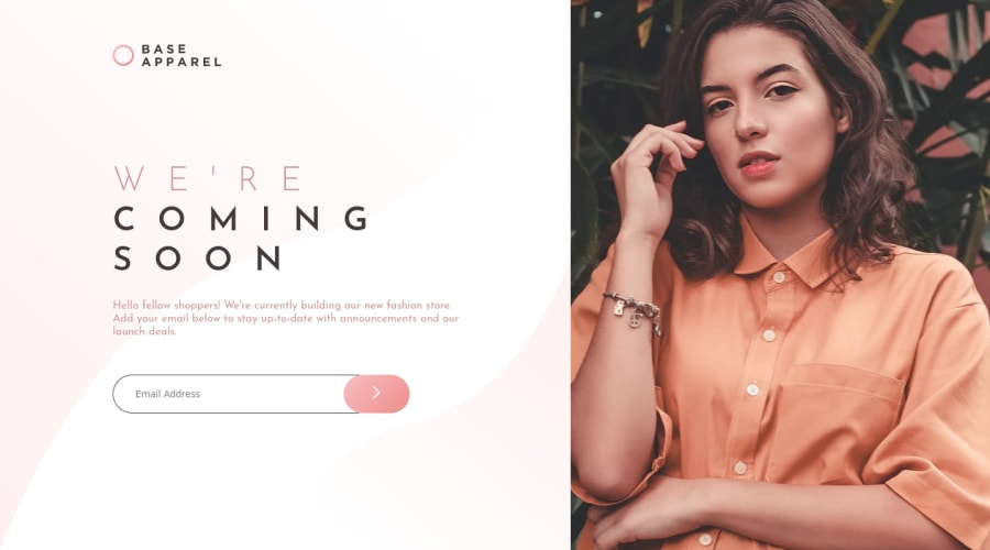
Base Apparel Coming Soon Page | Responsive | HTML CSS JS
Design comparison
Solution retrospective
Along with basic client side form validation this challenge tested my CSS skills. Totally enjoyed this one!
I'd really appreciate if you could answer the following:
What did I do wrong? What did I do right? How can I improve?
Thanks in advance :)
Happy coding & Merry Christmas :)
Community feedback
- @adriandotdevPosted over 3 years ago
Great work! <3
Try to change the border of the input field and try to fit the arrow button to the input field so it makes it look like more attached to it. Also, the letter spacing of the main title seems a little bit wider. try to adjust it and the font-size of it on 1440px screen size.
All in all. it looks great <3
0@itushPosted over 3 years ago@NADS-PROGRAMMER Thank you very much for the valuable feedbacks. I'm Happy to see, you liked my work:)
-
Changed the color of border of the input field. And it looks better now :)
-
Tried fitting the arrow button to the input field by changing widths of the input field & the arrow button but did not look any better. Hence, leaving it unchanged for now. (Note: According to "desktop-design.jpg" the total width of the input field & the arrow button is slightly bigger of the paragraph.)
-
I originally used 32px letter spacing. I tried reducing it, but it shrinks to a narrow width when compared to "desktop-design.jpg". Hence, leaving it unchanged.
-
I tried reducing the font size of the Main Title (currently its 48px) but looks very different from "desktop-design.jpg". Hence, leaving it unchanged.
Feel free to comment further on this or any of my other solutions.
Happy to connect & Happy coding:)
0 -
Please log in to post a comment
Log in with GitHubJoin our Discord community
Join thousands of Frontend Mentor community members taking the challenges, sharing resources, helping each other, and chatting about all things front-end!
Join our Discord
