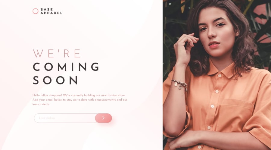
Base Apparel coming soon page Grid Flexbox JavaScript
Design comparison
Solution retrospective
Can someone help me?
Im still learning how to properly make responsive devices so I met some issues.
Two issues
I have two problems with small devices. First problem is with scrollbar in smartphone. When I hidden scrollbar I realize that devices with less high just cut content. But in the same time when I added overflow-y to solve this, I got huge empty space under content. I tried figure out what going on but I didnt have any idea how to fix it. So Ive just picked "lesser evil" because when I was making mobile layout I didnt have a script yet.
The next issue is form on screen size like tablets. I had problem with center it and I tried some solutions but it didnt work so I used position fixed and translate to put in right place. Ofc in some screens it dont look great but still better than before.
I will appreciate if someone can take a look to code and tell me whats wrong with it.
Community feedback
- @0xabdulkhaliqPosted over 1 year ago
Hello there 👋. Congratulations on successfully completing the challenge! 🎉
- I have other recommendations regarding your code that I believe will be of great interest to you.
BUTTONS 🖲️:
- This solution had generated accessibility error reports due to lack discernible text for
<button>
element
- The
<button>
must have discernible text that clearly describes the destination, purpose, function, or action for screen reader users.
- Screen reader users are not able to discern the purpose of elements with role="link", role="button", or role="menuitem" that do not have an accessible name.
- The
<button>
name rule has five markup patterns that pass test criteria:
<button id="al" aria-label="Name"></button> <button id="alb" aria-labelledby="labeldiv"></button> <div id="labeldiv">Button label</div> <button id="combo" aria-label="Aria Name">Name</button> <button id="buttonTitle" title="Title"></button>
-
Ensure that each
<button>
element and elements withrole="button"
have one of the following characteristics:- Inner text that is discernible to screen reader users.
- Non-empty
aria-label
attribute. aria-labelledby
pointing to element with text which is discernible to screen reader users.role="presentation"
orrole="none"
(ARIA 1.1) and is not in tab order (tabindex="-1"
)
.
I hope you find this helpful 😄 Above all, the solution you submitted is great !
Happy coding!
Marked as helpful0
Please log in to post a comment
Log in with GitHubJoin our Discord community
Join thousands of Frontend Mentor community members taking the challenges, sharing resources, helping each other, and chatting about all things front-end!
Join our Discord