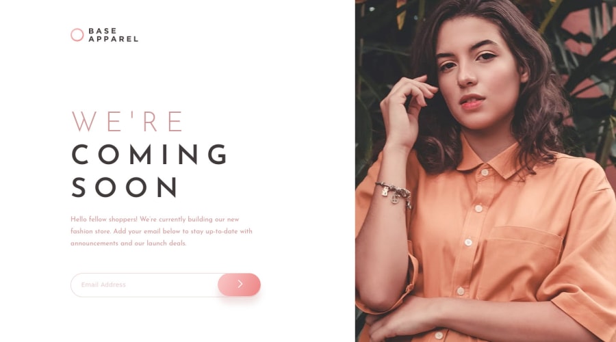
Base apparel coming soon page completed using HTML, CSS, JS & Jquery
Design comparison
Solution retrospective
How can I learn more about accessibilities in HTML 5? Please share any resources, books, articles, or videos. So, that I can improve and make more accessible web designs.
Community feedback
- @kenreibmanPosted almost 3 years ago
Hey! The project looks great.
It seems like you are missing the background image pattern for desktop.
To get rid of your accessibility issues in this project, I would:
- Change your
container
div to amain
element.<main class="container">
- You should also always have an
h1
in your HTML. I would make it yourhero-text
- For best practice, I also recommend putting
text-transform: uppercase
inhero-text
instead of writing "WE'RE COMING SOON" in html. - On your
button
I would put<button type="submit" aria-label="Name">
Don't forget to generate a new report on frontendmentor after changing your code in github!
To learn more about accessibility issues, I would read up on:
There are times like this challenge, where buttons may have no text in it, which would raise an accessibility issue flag. You can read about that here
Believe it or not, images also raise accessibility issues. There are also a lot of images used on these challenges that are purely decoration. In those cases you would use
aria-hidden
. You can read about that hereThere is also a video DesignCourse makes about ARIA that helped me understand better as well.
I hope this helped. Keep it up!
Marked as helpful1@arbaivPosted almost 3 years ago@lmaoken Thank you so much. This was really helpful. I completely missed the background image for desktop. I will make sure to generate a new report after updating my code.
0 - Change your
Please log in to post a comment
Log in with GitHubJoin our Discord community
Join thousands of Frontend Mentor community members taking the challenges, sharing resources, helping each other, and chatting about all things front-end!
Join our Discord