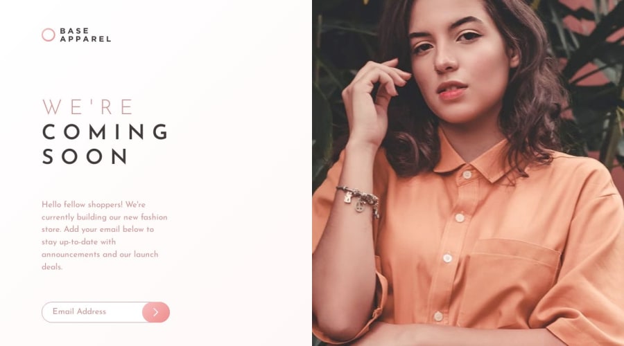
Design comparison
SolutionDesign
Community feedback
- @samuerikcoderPosted over 1 year ago
You can add a 100% height in the image if you like.
0@dasnewton305Posted over 1 year ago100% height making the image larger than the container height . I don't know why . @samuerikcoder
0@samuerikcoderPosted over 1 year ago@dasnewton305 I think the problem is not with the image but with the text part. If you notice there are some stretches with a lot of padding and margin. Change the padding of the .hero-section to try to make it align as in the original design.
Marked as helpful0
Please log in to post a comment
Log in with GitHubJoin our Discord community
Join thousands of Frontend Mentor community members taking the challenges, sharing resources, helping each other, and chatting about all things front-end!
Join our Discord
