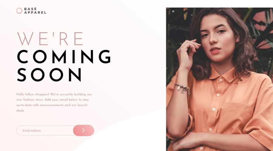
Design comparison
Solution retrospective
Hello :),
All the feedback is highly appreciated.
Thank you, Giorgian
Community feedback
- @louisdtbPosted over 1 year ago
It seems the logo is being clipped off the top of the screen and that you're using the
<main>element to control positioning and layout.To fix this clipping issue, I suggest reorganizing your layout such that rather than having three sections within main like this:
<main>
  <header/>
  <{content}/>
  <{picture}/>
</main>
That you instead split your page into two layout divs, placing all content in the first and the photo decoration in the second. Like this:
<main>
  <{content with header}/>
  <{picture}/>
</main>
This will allow you to put a simple
display: flexon<main>, to create a two-column structure.Flexbox will make organizing much cleaner.
Good luck!
1
Please log in to post a comment
Log in with GitHubJoin our Discord community
Join thousands of Frontend Mentor community members taking the challenges, sharing resources, helping each other, and chatting about all things front-end!
Join our Discord
