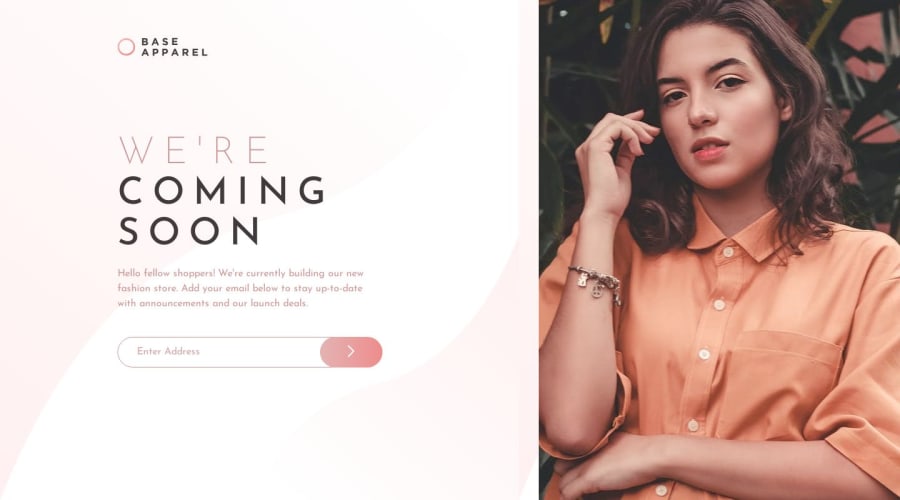
Design comparison
Solution retrospective
I started by creating all the HTML elements and assigning them classes. I moved onto the CSS, and started by importing fonts, and adding a background color for the entire webpage. Next, I started to design the login section of the web page, and spent some time trying to get the small details right (such as font sizes). I then moved to the layout, where I used margin and padding to get the layout and spacing between elements right. Furthermore, I spent some time playing around with the amount of margin for elements (left, right, top, bottom) trying to get it as close as possible. I used knowledge from prior projects and applied it to this one to achieve the design I was looking for. Overall, this project allowed me to learn some new things and further improve my vanilla JS skills. Once I finished, I tested the website on multiple browsers and used the built-in device size emulation feature to view what the website would look like on different devices. My next steps would be to learn some more CSS properties that can help create a more responsive design and web page.
Community feedback
Please log in to post a comment
Log in with GitHubJoin our Discord community
Join thousands of Frontend Mentor community members taking the challenges, sharing resources, helping each other, and chatting about all things front-end!
Join our Discord
