Design comparison
SolutionDesign
Solution retrospective
For the most part, placing things in the right area was easy, but there were some things that I clearly need to work on.
What I found difficult:
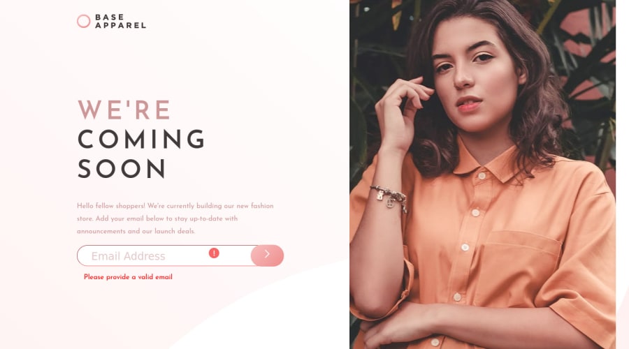
- Padding things within email input. I realized that there's no vertical aligning for text-inputs (at least that I'm aware of) so I had to pad things.
- Javascript 🤝 suicide ideation. While it was helpful to know that my logic was sound- getting it right with javascript syntax was painful.
- Button placement (still messed up)
Questions!
- I clearly need help with the button (colored red for now), what would you do to place it in the right place?
Community feedback
Please log in to post a comment
Log in with GitHubJoin our Discord community
Join thousands of Frontend Mentor community members taking the challenges, sharing resources, helping each other, and chatting about all things front-end!
Join our Discord
