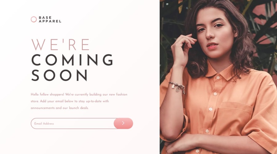
Design comparison
SolutionDesign
Solution retrospective
What are you most proud of, and what would you do differently next time?
- I learned how to deal with grid display
- a little bit about inputs
- how to fit images
- grid is a little bit confusing
- margins and padings are most challenging in this project
- the input pat but it is exciting, I like it, especially animations
- I don't understand why margins and paddings makes my project not dynamic?
- is positionig good to locate elements?
Community feedback
Please log in to post a comment
Log in with GitHubJoin our Discord community
Join thousands of Frontend Mentor community members taking the challenges, sharing resources, helping each other, and chatting about all things front-end!
Join our Discord
