Design comparison
SolutionDesign
Solution retrospective
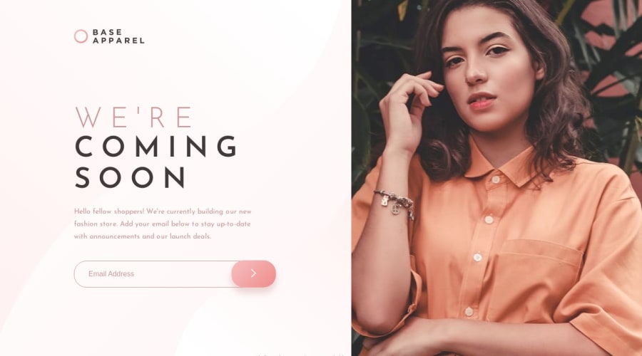
Hello there, This one took me a while to finish but it was a valuable learning experience. I had to rely on some YouTube tutorials to get it right. It taught me not to be overly precise with the units and how to leverage paddings and margins to make my website more responsive. I also learned how to make the website change layouts between desktop and mobile devices. Finally, I learned how to add in the error styles and not have them displayed until the user inputs an invalid email address. Let me know if you have any feedback. Have a good day.
Community feedback
Please log in to post a comment
Log in with GitHubJoin our Discord community
Join thousands of Frontend Mentor community members taking the challenges, sharing resources, helping each other, and chatting about all things front-end!
Join our Discord
