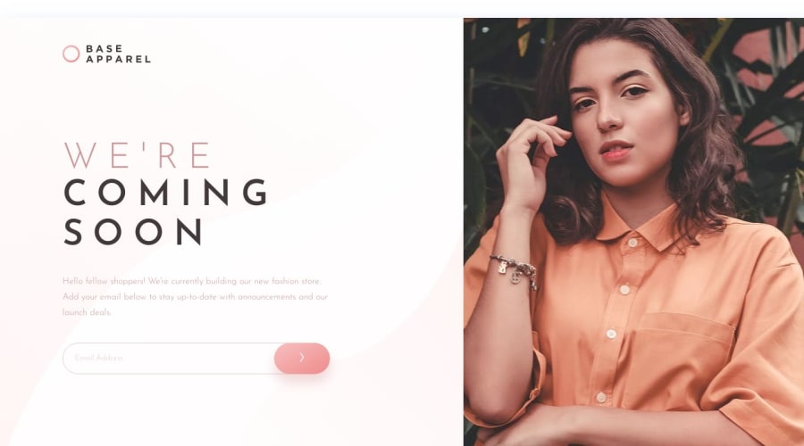
Design comparison
Solution retrospective
This project took me longer than I expected, and I learnt a lot from the details!
Needless to say, this solution still has a lot of room for improvement.
-
Javascript (app.js): could write with more simplicity.
-
CSS (style.css): for the Mobile UI, the layout lost its form when device width is smaller than 375px. I'm not sure I've done it right.
-
CSS (style.css): for the Desktop UI, the background image doesn't 100% match the design file. I wonder if there's a better solution for this?
-
CSS (style.css)/ HTML (index.html): for the arrow.svg, I couldn't find a way to change its thickness to 2px as design file suggested, and unable to make it horizontally and vertically center in the button.
Any feedback or advice is highly welcomed.
Community feedback
Please log in to post a comment
Log in with GitHubJoin our Discord community
Join thousands of Frontend Mentor community members taking the challenges, sharing resources, helping each other, and chatting about all things front-end!
Join our Discord
