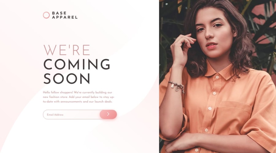


Design comparison

Solution retrospective
FEEDBACKS ARE WELCOME
Community feedback
- @khatri2002Posted 4 months ago
The developed solution looks fantastic! However, there’s one small improvement to make it even better:
The container holding the text content should have a linear gradient color in the background, along with the background image. Currently, while the background image has been included, the gradient color is missing.
To ensure it matches the given design reference, please add the linear gradient. The specific gradient colors and angle are detailed in the
style-guide.mdfile.1@jovic-djordjePosted 4 months ago@khatri2002 Thank you for taking the time to leave the comment. It's a small detail but makes a lot of difference and I didn't even notice that 😅
1

Please log in to post a comment
Log in with GitHubJoin our Discord community
Join thousands of Frontend Mentor community members taking the challenges, sharing resources, helping each other, and chatting about all things front-end!
Join our Discord