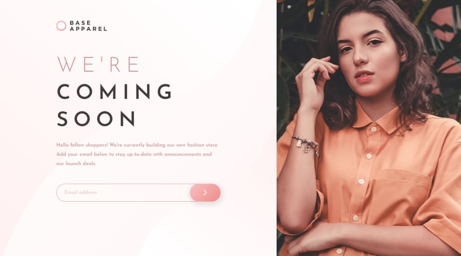
Design comparison
SolutionDesign
Solution retrospective
Any feedback or advice is greatly appreciated. Keep improving!
Community feedback
- @ApplePieGiraffePosted almost 4 years ago
Greetings, Vincent Frank! 👋
Nice work on this challenge! 🙌 Your solution is responsive and the form validation works well! 👍
I suggest,
- Labeling the input and button element in some way (as your solution report suggests) in order to identify them and make your solution more accessible.
- Adding
overflow-x: hiddento thebodyto prevent a horizontal scroll bar from appearing along the bottom of the screen at certain screen widths. - Making sure the heading and the paragraph below it do not cover up the logo when the height of the screen decreases in the desktop layout.
- Adding a max-width to the input element to prevent it from becoming too wide on extra-large screens.
Hope those tips help. 🙂
Keep coding (and happy coding, too)! 😁
2
Please log in to post a comment
Log in with GitHubJoin our Discord community
Join thousands of Frontend Mentor community members taking the challenges, sharing resources, helping each other, and chatting about all things front-end!
Join our Discord
