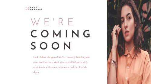
Base Apparel - FrontEnd Mentor Solution

Solution retrospective
Being able to finish the project and work on developing an basic responsive website. I feel like major improvements could still be made in regards to making the CSS cleaner
What challenges did you encounter, and how did you overcome them?I had issues with the mobile part because of the order property was just not working the way I wanted it to. I originally did this in grid and thought I could just do a grid-template-columns 1 to make it all stack on top of each other and then change the order property. But I just couldn't get the image to stack on top of the text unless the logo part was at the bottom. Every section was able to move when I changed the order so I knew the order property was working properly, just for whatever reason I I could only move image to very top or to the very bottom.
I decided to change the project layout from grid to flex as I already spent a lot of time trying to achieve the proper the mobile layout and then played around with the HTML structure as I was testing out to see what was causing the layout issues in mobile.
What specific areas of your project would you like help with?Any feedback will greatly help
Please log in to post a comment
Log in with GitHubCommunity feedback
No feedback yet. Be the first to give feedback on RhysT97's solution.
Join our Discord community
Join thousands of Frontend Mentor community members taking the challenges, sharing resources, helping each other, and chatting about all things front-end!
Join our Discord