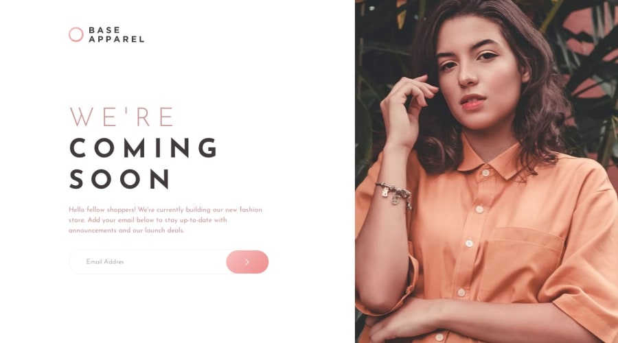
Base Appaarel Card (CSS Flexbox)
Design comparison
Solution retrospective
Hello everyone, I wanted to make an animation with this project is something basicon but I really liked the result, I probably worked a little more on the part of the card and the styles themselves, but I think I got a good result and with my code. As always any comments to help me in my code and design, you can let me know in the comments box. Happy coding.
Community feedback
- @AGutierrezRPosted almost 2 years ago
Hello there 👋. Good job on completing the challenge!
I have some suggestions about your code that might interest you.
HTML:
- You don’t need to put everything inside a
<main>tag. This page hasheader,main, and if you want to, afooterwith your information. You could structure your page like this:
<body>
<div>
<header>
</header>

<div aria-hidden="true">
</div>

<main>
</main>

<footer>
</footer>
</div>
</body>
The first
<div>could be used to give a general layout style (Flex, Grid, etc), and thearia-hiddenelement is there to be able to create an element outside the landmarks (header,main,footer) without raising any accessibility warningThat image represents no important information on the page so
aria-hiddenis to express that.With this layout, you don't have to make the
card__boxabsolute and that kind of stuff- If you want to create an
inputwith an error icon and error message like the one in the design you could use this structure
<div class="relative">
<label> ... </label>
<input type="text">
<div class="absolute">
</div>
<button class="absolute">
</button>
</div>
<div>
</div>
I only describe the structure and the positioning, you could play around with the styles until you find the layout
CSS:
- You could set the breakpoint from mobile to desktop in
1024px. This gives you room to arrange elements. - If you use the structure described above, you have the mobile layout easily, you just have to find the padding and the margins. I recommend to set a
max-widthto the<main>content and keep it center in mobile - For the desktop layout, you could use CSS Grid, is more flexible to arrange everything. You could see my submission here, is in Tailwind but you could find the grid configuration easy
I hope you find this helpful 😁. Most importantly, your submitted solution is fantastic!
Happy coding!
Marked as helpful2@3eze3Posted almost 2 years ago@AGutierrezR Thanks for your suggestions and compliments! I really appreciate your help. I agree to structure the HTML with sections like header, main content, and footer. The suggestion to use aria-hidden for elements outside of landmarks is helpful. I also like the idea of creating an input field with icon and error message, and I'll explore the structure and styles you mentioned.
As for the CSS, setting the breakpoint to 1024px for desktop layout is a good choice, and I'll consider using CSS Grid for more flexibility in content layout.
In summary, I appreciate your suggestions and I will take them into account to continue improving my code. Thanks again and happy programming!
0 - You don’t need to put everything inside a
Please log in to post a comment
Log in with GitHubJoin our Discord community
Join thousands of Frontend Mentor community members taking the challenges, sharing resources, helping each other, and chatting about all things front-end!
Join our Discord
