Submitted over 2 years ago
Barely-responsive product preview card, using flexbox & srcset plshelp

@hran-8

Design comparison
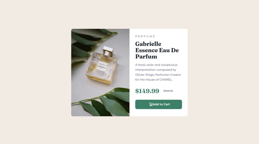
SolutionDesign

Solution retrospective
ISSUES WITH MY SOLUTION:
- Only completely optimized on viewport widths 1440px and 375px. The biggest issue is with the main perfume image
- Used srcset attribute in my <img> tag for the main perfume image to change when the viewport reaches 375w or 1440w-- this works fine but when I try to change the values around (in the srcset values) to adapt to widths in between 375px and 1440px, the image stretches/distorts or unwanted gaps are formed in the image container.
I tried to use relative units for most of the sizing. I don't know how to make the image properly scale depending on the size of the viewport while avoiding making multiple media queries. Any help or tips would be greatly appreciated.
Community feedback
Please log in to post a comment
Log in with GitHub
Join our Discord community
Join thousands of Frontend Mentor community members taking the challenges, sharing resources, helping each other, and chatting about all things front-end!
Join our Discord