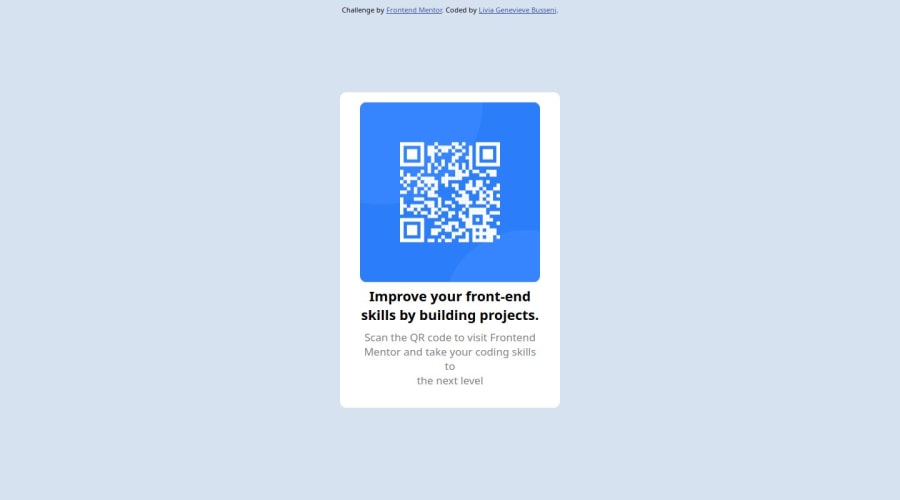
Design comparison
Solution retrospective
What are you most proud of: I was able to code this independently from beginning to end, starting from zero. I built a public GitHub file, enabled Gitbug pages for Continuous deployment (CD), explored Figma trying to extrapolate the design elements. I learned there is a plugin called animaapp that turns images into CSS and HTML which I could not use on the free Figma version unfortunately(https://www.animaapp.com/) and produced a version which is not the same as the challenge but pretty close.
What would you do differently next time: review CSS documentation before starting. I have not been using CSS for a long time and I struggled to remember all the different available commands. I would also ask my CSS expert friends for help to speed up the process.
What challenges did you encounter, and how did you overcome them?I had a very hard time applying the correct CSS commands as I was not able to find out what fonts had been used and other key design elements. I had to code by trial and error and it got pretty tiring.
What specific areas of your project would you like help with?I would like for my CSS code to be reviewed so gaps can be highlighted and feedback provided.
Community feedback
Please log in to post a comment
Log in with GitHubJoin our Discord community
Join thousands of Frontend Mentor community members taking the challenges, sharing resources, helping each other, and chatting about all things front-end!
Join our Discord
