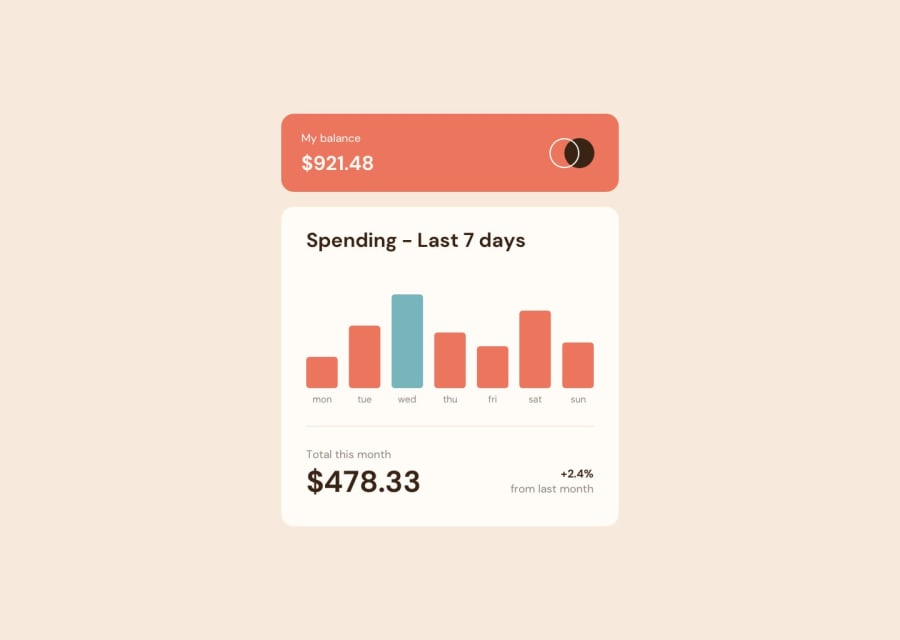
Design comparison
SolutionDesign
Solution retrospective
I am a thirteen year old boy who loves coding. My coding instructor introduced me to front end mentor. And since the my abilities have greatly improved. Please I am open to any corrections thank you😊😊😊😊😊😊.
Community feedback
- @hmadamkPosted about 2 years ago
well done a few notes though
- you should use heading in order so h1 > h2 >h3 etc and manipulate the font size later as you want remember that the headings indicate section of your app so the page is a section and should have a name inside of h1 the card is a subsection and should have a name inside of an h2 and so on remember heading indicate the level of this section not for big font and all you landmarks must have an h2 level heading
- make sure that all of your page is contained by a landmark examples of landmarks are
header for the top section
main for your main section
section with aria-label to describe why you added this section
footer for the bottom section
Marked as helpful1
Please log in to post a comment
Log in with GitHubJoin our Discord community
Join thousands of Frontend Mentor community members taking the challenges, sharing resources, helping each other, and chatting about all things front-end!
Join our Discord
